


Image Credit: Crown Paints
10 colours that are going to shape our interiors in 2026
After years of drenching our homes in quiet neutrals, 2026 will see British homes shaking off the safe colour shackles.
This is a year defined by confident comfort and embracing shades that feel familiar but come with a playful twist.
Earthy hues warmed by sunlight, heritage colours given a fresher edge, and bold combinations that are anything but boring.
“For a long time, many of us have played it safe with colour at home, defaulting to whites, beiges and soft greys out of fear that bolder shades will date or feel overwhelming,” explains Dayna Isom Johnson, trend expert at Etsy.
“What we’re seeing for 2026, however, is a real shift in confidence.
“People are becoming more open to colour again, but in a way that feels calm, considered and very liveable.”
According to the colour experts this year’s colour story will see us breaking out of the identikit paint mould (greys, whites and creams) to try unexpected pairings and hues previously confined to decorating 101.
“Overall, the shift is away from overly styled, generic interiors and towards homes that feel more personal, comforting and expressive,” Dayna continues.
“Colour is becoming a tool for creating warmth and character – not something to be afraid of.”
From grounding greens to serene blues and burnt terracotta tones, these are the colours and trends we can expect to see dominating spaces in 2026 and beyond.
Patina blue
Etsy’s Colour of the Year, Patina blue is having a moment thanks to its timeless charm.
Soft yet full of personality, this blue hue captures the laid-back appeal of the seaside, while also feeling fresh, modern and easy to live with.
“Inspired by the natural oxidation of copper, this rich tone feels calming and lived in rather than crisp or cold,” explains Dayna.
“It works beautifully as an accent colour, through planters, wall art, soft furnishings or statement decorative pieces and adds depth without overwhelming a space.”
Victoria Yardley, founder of Victory Colours agrees we’re going to see a shift towards blues with warmer undertones.
“Smoky navy, heritage denim blues and indigo shades softened with grey will dominate,” she advises.
“These blues feel sophisticated and calming and work beautifully with brass and natural materials, creating spaces that feel both elegant and relaxed.”
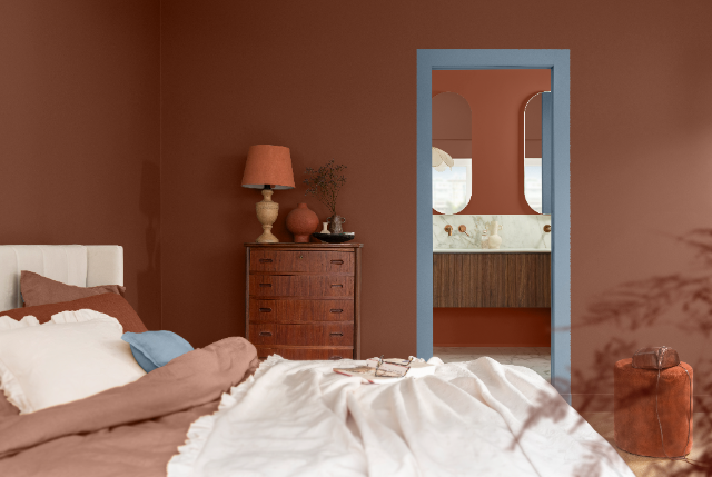
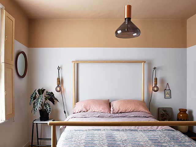
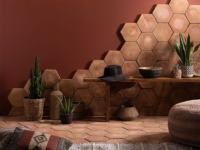
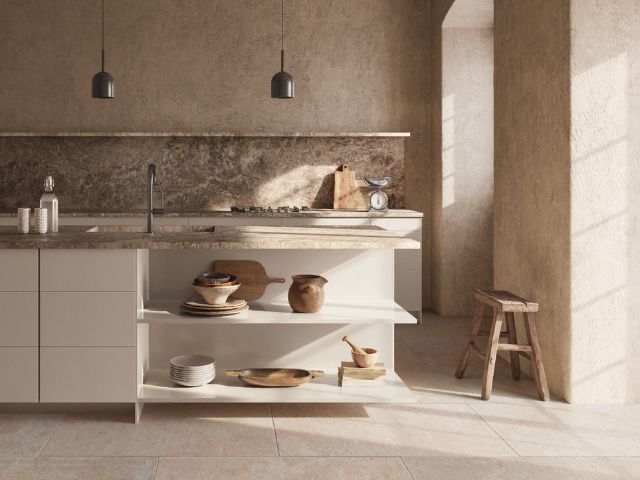
Warm neutrals
Sun-baked colours and terracotta tones are set to dominate 2026 as Brits lean into warmth, tactility and escapism, using these clay-rich, sun-warmed shades to create spaces that feel grounded, welcoming and reminiscent of slower, Mediterranean living.
“We’re seeing growing interest in sunbaked clay and burnt terracotta,” explains Dayna.
“These earthy tones bridge the gap between neutral and colour and are ideal for kitchens, dining spaces and living areas, where they add softness and an artisanal feel.”
Victoria says this move towards clay-based tones suggests neutrals look set to evolve in the coming months.
“Expect to see warm beiges, soft oat colours and gentle clay pinks that feel human and lived-in become increasingly popular throughout the year,” she explains.
“The neutrals of 2026 are warmer and more characterful.
“They feel grounding and comforting, without the flatness of traditional magnolia.”
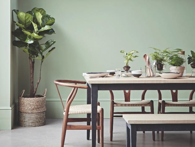
Grounded greens inspired by nature
From soft sage and olive to deeper forest and khaki, grounded greens will be everywhere this year, creating a layered, natural palette that is calming and sophisticated.
“Muted greens will be one of the standout trends of 2026, with shades inspired by forests, gardens and natural landscapes taking centre stage,” explains Victoria.
“Mossy tones, eucalyptus greens and herb-like sages are set to replace cooler, sharper hues.
“Green is incredibly powerful psychologically and will bring an instant sense of calm and connection to nature, helping spaces feel restorative rather than overstimulating.”
![[tag]](https://www.goodhomesmagazine.com/wp-content/uploads/2020/09/dulux-greenhouse.jpg)
Burnt orange revival
Thanks, in part, to Taylor Swift, burnt orange is making a comeback, but in 2026 we’ll see it used in a softer, more relaxed way.
“Instead of bright, punchy tones, this year’s oranges are warm, earthy and easy to live with,” says Kathryn Lloyd, colour specialist at Crown Paints.
“Fashion is leading the charge here too – Chanel has used burnt orange as a key shade in its 2026 palette, with designers like Jean Paul Gaultier and Christian Siriano also backing richer, rust-inspired tones on the runway.”
Rich but not overpowering, Kathryn says Crown’s Crimson Fox captures the new orange perfectly, working well in living rooms, bedrooms or dining areas and pairing beautifully with natural woods, warm browns or gentle neutrals.
“Burnt orange is a great way to add warmth without committing to a bold colour story,” she adds.
Warm off-whites
As we move into 2026, warm off-whites are becoming a go-to choice for interiors, with Pantone’s Colour of the Year, Cloud Dancer, exemplifying this trend.
“These soft, inviting neutrals create a sense of comfort and approachability, making rooms feel lived-in and welcoming,” explains Kate Palmer, creative director at The Painted Furniture Company.
“Their versatility allows them to pair seamlessly with natural textures, wood tones and accent colours, providing a timeless canvas that adapts to changing styles.
“In an era where calm, grounded and emotionally restorative spaces are increasingly valued, off-whites offer quiet sophistication while enhancing light and space.”
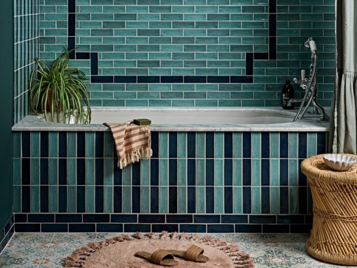
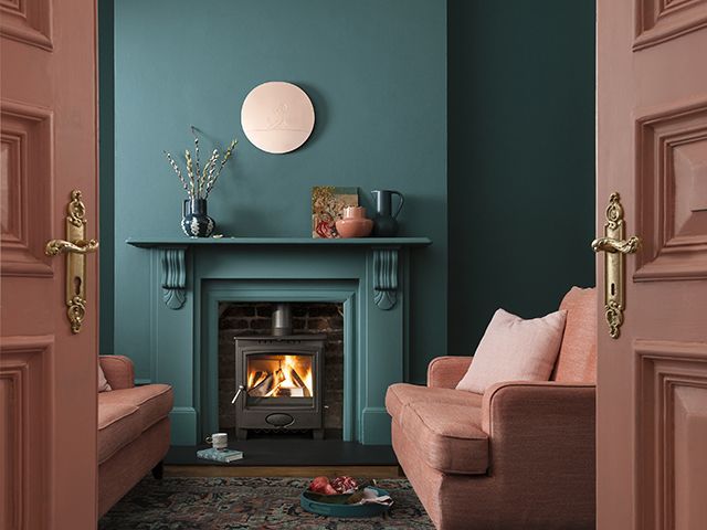
Teal
For those ready to take the leap into bolder colour, it’s time to turn to teal.
Already making waves across the interiors world, teal offers a richer jewel tone that feels confident yet calming.
“It pairs effortlessly with complementary shades, from warm beige and terracotta to deeper tones such as navy and berry, making it a versatile choice for creating depth and interest within a space,” advises James Mellan-Matulewicz, creative director at Bobbi Beck.
“Introducing wallpaper in a teal shade is an easy way to add something different to your walls, bringing character without overwhelming.
“Teal is also ideal for colour blocking,” James continues. “Allowing furniture and accessories in similar shades to work together for a cohesive and considered finish.”
According to Chloe Barrow, interior expert at Laura James the trick with styling teal is to start small. “A statement chair in rich teal instantly anchors a room without the pressure of a full renovation,” she explains.
“Adding accent pillows or textured throws can also be a great way of teasing a playful teal palette without a heavy investment, particularly in bedrooms where colour can often feel more personal.”
Chloe says introducing colour in small pockets can allow you to make subtle adjustments around your home as your lifestyle or preferences shift without the need of a complete overhaul.
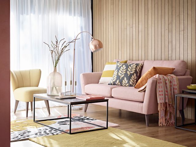
Muted pastels
According to Ana Zuravliova, trends specialist at Blinds Direct muted pastels like powder blue, soft blush and sage green will continue to prove popular in 2026.
“These shades bring gentle colour into a room without feeling overpowering,” she explains.
“They strike the perfect balance between freshness and serenity, which is exactly what many homeowners are looking for now.”
Ana says lighter yellow tones have been a favourite this year and she expects to see them evolve into deeper shades like mustard in 2026.
“These warm yellow tones bring a sense of optimism and pair beautifully with earthy neutrals and natural materials.”
Rich browns and burgundy
These deeper, more luxurious tones add character and elegance without being overwhelming.
“Cooler browns will still feature in some spaces, especially as a transitional choice from the greys we’ve seen dominate, but the trend is shifting towards richer, warmer, more emotive hues,” Ana adds.
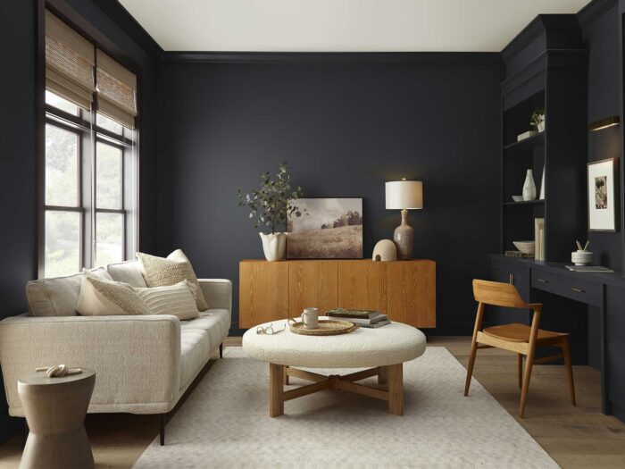
Black tones
Experts say black tones will also prove popular in 2026 as designers embrace their ability to add depth, contrast and drama, using softer, layered blacks to ground interiors while letting colour, texture and light take centre stage.
“One slightly unexpected trend is the return of black curtains,” says Ana.
“Done right, they can look incredibly sleek and modern.
“They add instant drama and sophistication, especially when contrasted with lighter walls and textured finishes. Black is bold, but in the right space, it works beautifully.”
Want more inspiration? Read: Après-ski interiors are winter’s biggest look: 8 ways to bring cabincore into your home. And check out Swag gap interiors: 9 ways to embrace the trend
READ MORE: