


George Clarke is an ambassador for Sofology
11 things George Clarke wants you to know about layout
When it comes to the interior design of your home, there’s a lot to think about.
From working out the paint colours that will look best in different rooms to deciding on the overall feel you want to achieve – there are so many elements to consider.
But one fundamental factor that isn’t always given the attention it needs is the layout.
“Layout is unbelievably important,” TV presenter and architect, George Clarke tells us.
“If you don’t get the layout right nothing else feels right. If your space flows and works properly it just makes you feel better, happier.
“It means that your day-to-day tasks, whatever they might be, become more enjoyable because the space is supporting you and giving you everything you need to perform that task.”
On the flipside George says getting the layout wrong not only can be an annoyance – it can actually have an impact on your mental wellbeing and quality of life.
That’s a sentiment backed up by a recent survey, which found that two-thirds of Brits say the layout of a room impacts their mood.
The poll, of 2,000 Brits, also found that while 56% feel there is something not quite right with the layout of their sitting room, over a third (36%) can’t put their finger on what exactly the problem is.
Thankfully the TV presenter and architect is on hand to impart his expert knowledge on all things layout.
From the importance of furniture size to making a space feel bigger and avoiding “Bed and Breakfast architecture” George Clarke shares his tips on maximising layout, no matter your home’s size…
The function and flow of a space are key
When it comes to designing the layout of a space, first and foremost it is important to consider the function of that area.
“Then you need to consider how much space you need for that particular task,” George explains.
As for flow George says it’s isn’t just about how you occupy a space but also how you move through it.
“How do you move from one room to the next? How do you get from the living room to the hallway to the kitchen and what’s that experience like?” he says.
“You need to balance the amount of space, with the quality of the space and the flow of the space.
So balance, quality and flow are three things that it is massively important to get right.”
If the balance and the quality and the flow of spaces work George it can have some real benefits on every day living.
“Everything’s effortless, everything’s enjoyable and then that becomes a quality piece of architecture that contributes to your quality of life and wellbeing.”
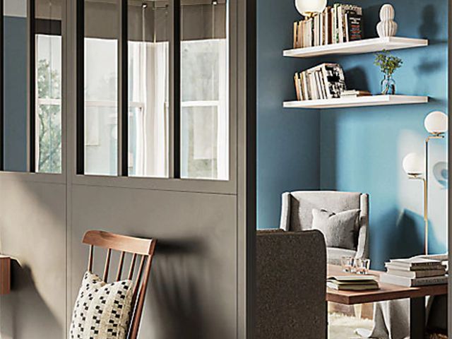
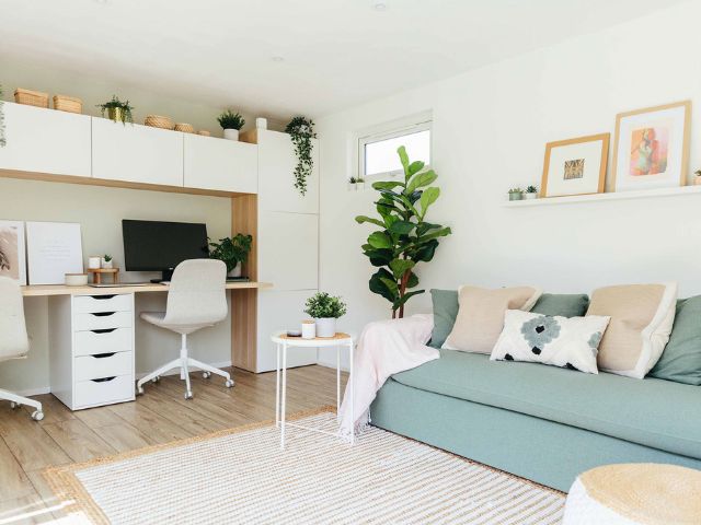
Consider the ‘relaxation, entertaining, workspace triangle’
Just as a well-designed kitchen features the golden triangle of sink, fridge and oven all within easy access, George says a well-designed living space also has three key elements to consider.
“You could argue that in a big, open plan space that you need a relaxation space, an entertaining space and a work space and you could look at how the triangle works between those three,” he explains.
“It’s something to be aware of when you are designing your layout, but it’s not as strict as the golden triangle.
‘It’s about being aware that there’s a trio of spaces that you might want to connect in some way, or maybe even disconnect in others.
“For example my entertaining space can be near my relaxing space, but my workspace needs to feel slightly separate because I like to have a boundary between my home life and work life.
“It’s about finding balance within a space.”
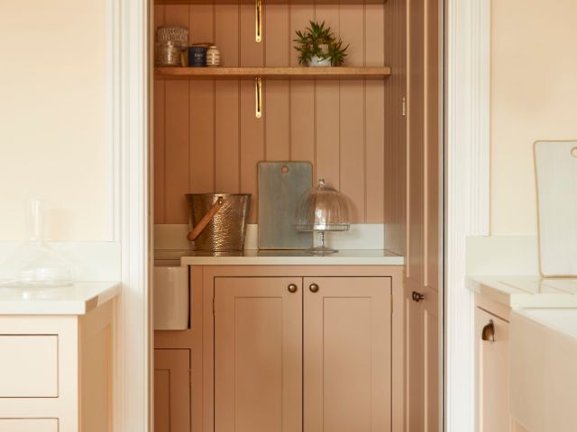
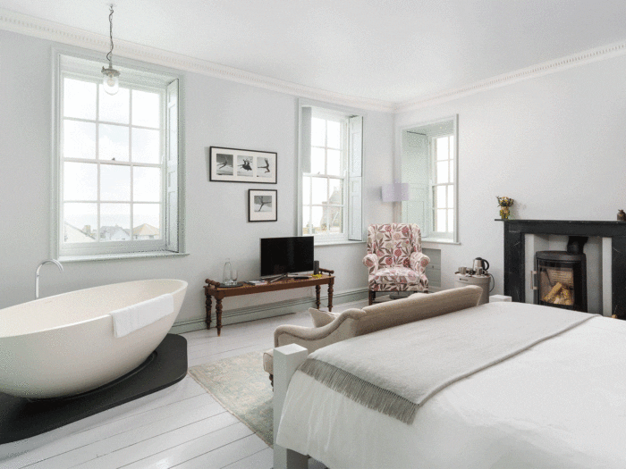
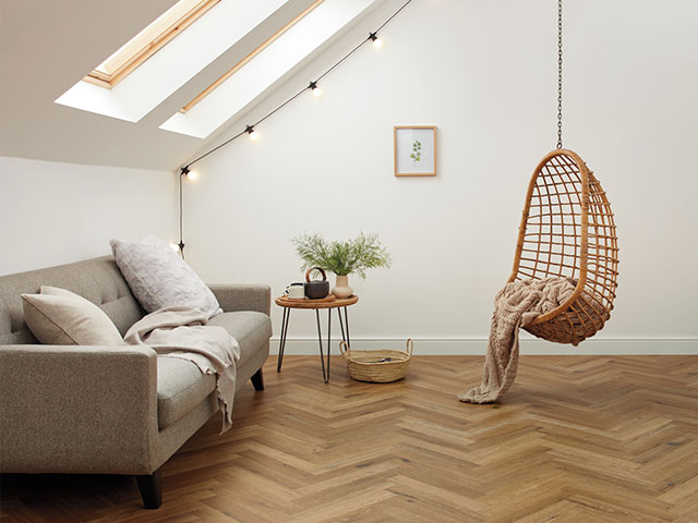
Don’t forget about natural light
George suggests considering having windows in the areas where you’ll spend most of your time, and using darker spaces for storage or utility spaces – Or for a snug that you might want to be a bit more intimate.
“I always start looking at the dark, gloomy parts of a plan and think how can I reconfigure some of the areas that don’t need as much natural light,” he explains.
“This means the prime quality spaces become spaces you can really enjoy, where you might have a beautiful bay window for example.”
He cites the example of a utility room as a space you can locate in a darker part of the home.
“Utility rooms are really important to the function of the home and it needs to be in the right position, but it could be in some of the lower quality areas of your home,” he explains.
“Putting toilets, shower rooms and utility rooms in some of the darker, pokier spaces allows you to free up better quality spaces for you to enjoy for prime living areas.”
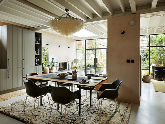
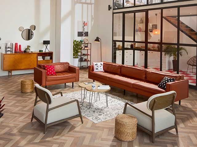
Embrace open plan but in a more flexible way
While the trend for open plan has been popular of late, George says he’s seeing a shift in desire for more separate, individual spaces.
“Open plan was a massive thing in the 90s and 00s when people were doing warehouse conversions, which then rippled through to all housing,” he explains.
“But now people are questioning whether they want everything so open.
“Having living, kitchen, dining in one massive space hasn’t totally disappeared but has certainly become less popular and things have become more of a hybrid with people using screens or storage to have a bit of intimacy or privacy.”
The best way forward, George says, is to have a layout that is flexible, where you have defined areas, but still have the flow through you get with open plan.
“People are deciding that they might need just a little bit of difference between their relaxation, entertaining and home life with their work life,” he explains.
“If your house isn’t big enough to have a separate living room people are now looking at introducing space dividers.
“So you can either put up low level walls, architectural room dividers, shelving you can look through, which screen between one space and the next.
“It starts to define zones in a strong way, but by using planting or screens or two-way open shelving, the space is divided but connected.”
George says there are many benefits to this kind of broken plan design.
“You’ve got a great sense of space and its still open plan, but you’ve been very careful about how you’ve designed those zones to create more intimate spaces in the home,” he adds.
Don’t be afraid to mix up the design of your layout ‘zones’
While the temptation may be to tie the various zones together, George says people shouldn’t feel restricted by this.
“On the one hand I would suggest tying all the spaces together so it’s one uniform, unified piece of design, but equally you could mix up the look in the different zones,” he says.
“So your workspace might have a timber floor and then you might change to carpet in your relaxation/snug area.”
George says the important thing to remember is there are no hard or fast rules about this.
“It’s about personal taste,” he explains.
“If it’s a small space you might want to unify it or it might be a bit too busy, but if you’ve got a big space you might decide you don’t want it too unified.”
Remember to consider scale
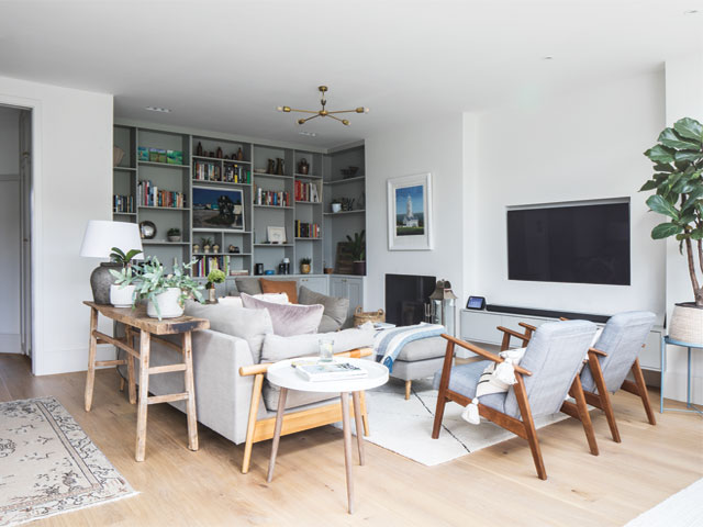
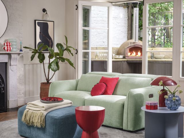
George says one of the most common layout errors people make is choosing the wrong size furniture for a space.
“I can’t tell you how many times I’ve walked into a relatively small space and people have bought the biggest sofa you could ever imagine,” he says.
“If your furniture size is right for the space and has really been thought about, the space feels like it works.
“But if the furniture is disproportionately big or small it feels like there’s something wrong.
“You’re balancing the scale, the size and style of the furniture with how a room wants to feel for you.”
Positioning furniture in the space is also important
You might think that the positioning of furniture is something that comes after the layout has been agreed upon, but George recommends giving it due consideration from the start.
“When my team designs a space the furniture is on the plan from the beginning,” George explains.
If you’re planning your own layout George suggests getting the tape measure out, getting some gridded or graph paper and drawing your plan out to scale, then adding in the furniture.
“Then when you start planning it think about the furniture size, how big is your sofa, your side units, you can even cut out to scale the sofa you’re thinking about buying and start positioning them on that gridded paper,” he continues.
To make it even easier to get an idea of scale you can even mark it out in the space on the floor and also on the walls.
“Measure out how high your sofa is going to come up and put a marker on the walls,” George adds.
“Then you can literally stand in the space and start walking through to make sure it works properly.
“If you’re wondering whether to buy a coffee table that is 1.2m long or 80cm you can mark it out and you’ll be able to see if it works in the space.”
Avoid ‘Bed and breakfast’ architecture
By trying to make a space work too hard, this can often lead to the creation of awkward spaces.
“I call it bed and breakfast architecture,” George explains.
“When a building has been converted to fit a new function and you’re left with an excess of corridors and awkward spaces from trying carve out an ensuite in a bedroom.
“Often people will try to squeeze things in to fulfil a function but it’s completely to the detriment of the architecture.”
To avoid this George suggests having a look at the overall layout of the home and considering other options, such as stealing a few metres off another room, or totally rethinking the space you’re trying to achieve.
Don’t fall for the push furniture to the edge of the room trick
A classic mistake, George says, is pushing furniture right to the edge of the room thinking it will give the illusion of a bigger space. “And I used to be guilty of this,” he admits.
“Especially of pushing the sofa up against the wall, but then what happens is you create a lot of space between your sofa and your TV and it can actually be so big it is wasteful.”
George says he learnt the benefits of bringing furniture in from the wall from a designer he worked with previously.
“I was designing a space with her and she suggested we pull the sofa into the space,” he explains.
“I wasn’t sure at first as I thought it would make the space feel small, but when she pulled it away from the wall she created an area behind the sofa where you could have book shelves, lamps on a unit.”
“Obviously you don’t want the space in front of the sofa to be too small, but all of a sudden she created another zone, it felt like another mini room within the space,” George continues.
“Ultimately it made the space work harder because that wall then became usable for things like books, displays of family pictures, art.
“Pushing the sofa against the back wall means you can do nothing behind it.”
Utilise other layout tricks to make a space feel bigger
George says integrated storage usually makes a space feel larger.
“If you’ve got too many freestanding bits of furniture it can make a space feel cluttered,” he explains.
Other suggestions for giving the illusion of space include decluttering and introducing more natural light into a space.
“And while it’s not layout related the colours you choose can make a room feel larger,” George continues.
“It sounds obvious but I you use really deep, dark colours, that might be good for the quality of the space, but it’s going to make it feel more intimate.
“Lighter colours bounce more light around, which makes a space feel bigger.”
Find a way to take your layout to the next level
While George says function is the most important thing to consider initially once a space does everything you want it to do, he suggests finding a way to raise it to the next level to make it really special.
“Rather than just being functional it becomes really beautiful as well,” he explains.
“For example I might put a bathroom upstairs in less prime space and once I’ve got a function I might then consider putting in a skylight in.
“And then rather than it being a flat ceiling, let’s open the ceiling up to the pitch of the roof.
“You don’t have to do that because the space functions but doing so means it’s now not just a functional room it is a beautiful piece of architecture.”
George Clarke is an ambassador for style and design-led sofa brand, Sofology.
Looking for more interiors inspiration? Take a look at How to add character to a new-build (without it looking naff) or Wabi Sabi interiors: 11 ways to get the calming look in your home.
READ MORE: