


Image credit: Furniture and Choice
Balamory is coming back and it’s inspiring playful interiors in our home
Is it just us or has there been a bit of an uptick in more colourful interiors recently?
As well as the Labubu and Tutti Frutti crazes, we’re putting it down to the return of a certain children’s TV show that will have everyone singing “What’s the story in Balamory?” once again!
Yep, after 20 years CBeebies’ beloved children’s series, Balamory, is making a joyful return to our screens.
Of course, the announcement has sparked a wave of nostalgia, not just among fans who grew up with the show, but also in the world of interiors, where Balamory’s iconic, vibrant homes continue to inspire playful, colourful design.
Set in the picturesque, pastel-hued town of Tobermory in Scotland, Balamory enchanted viewers with its rainbow-hued palette and cheerful characters.
The show’s bold, block-colour houses – each a character in their own right – became a symbol of happiness, creativity, and self-expression.
Today, as the show prepares for its comeback, its legacy lives on in the world of home decor, where colour is celebrated for its power to uplift and energise.
“Colour has an extraordinary ability to influence our mood and wellbeing,” says content creator Elise Dodds, whose own home is a riot of joyful hues.
“I’ve always been drawn to bright, happy colours and the sense of fun and energy they bring to a space.
“Filling my home with vibrant shades creates an environment that feels joyful, welcoming, and full of life.”
Magdalena Gierasinska, head of product and displays and Barker and Stonehouse agrees that it’s a desire to that’s driving this step away from the more demure interiors.
“More than ever, our homes are directly tied to our sense of wellbeing,” she explains.
“Recent research we carried out at Barker & Stonehouse found that almost one in four people say their home influences their mood, and for a third of us, the effect is significant.”
Playful design is also being fuelled by the rise of dopamine décor, Gen Z maximalism, and a broader celebration of self-expression.
“It’s about fun, optimism, and nostalgia, which are ideas we’re seeing echoed everywhere from fashion runways to furniture collections,” Magdalena continues.
“After the past few years, there’s a strong desire to embrace colour, pattern, and personality, and to create spaces that feel energising rather than restrained.”
Ultimately, Magdalena says, it’s not just about decorating for style anymore; it’s about decorating for joy.
“Interiors have become a way to curate how we want to feel in our homes, and right now, that feeling is all about happiness, vibrancy, and a touch of playfulness,” she adds.
From fun stripes to primary colour accents, front doors in vivid tones to patterned wallpaper we spoke to the design experts about introducing some Balamory cheer into your home without making it look like a preschool set.
Turns out it’s all about balance: using stripes or murals as focal points, incorporating fun colours in soft furnishings rather than whole rooms, or limiting very bold tones to doors, cabinetry or accent walls.
Whether you fancy adopting the statement walls in Miss Hoolie green or kitchen accents in PC Plum blue, Balamory’s palette is inspiring a new generation to embrace bold design choices.
So as we prepare to welcome the show’s return, it’s the perfect moment to rediscover the magic of colour in our homes – reminding us that, just like in Balamory, every shade has a story to tell.
Go primary light
While primary colours, red, yellow, and blue, form the foundation of colour theory and naturally complement one another, Magdalena says large expanses of these vivid hues side by side can feel overwhelming.
“To create a more refined and harmonious look, I recommend grounding these bold shades with warm neutrals and natural wood finishes,” she suggests.
“This not only softens the contrast but also adds warmth and sophistication, ensuring the space feels intentional rather than overpowering.”
For a beautifully balanced interior, Magdalena also advises adopting the 80-20 colour rule.
“This approach sees 80 per cent of the space dressed in soft, neutral tones,” she explains.
“The remaining 20% is where you introduce bold accent colours through statement furniture, playful patterns, tactile fabrics, or striking décor.
“This contrast adds depth and character without overwhelming the space, striking the perfect harmony between subtle sophistication and vibrant personality.”
Match your palette to the room’s vibe
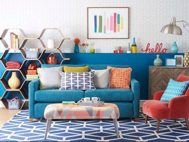
Interior experts say that even small pops of vibrant colour – a feature wall, bright doors, cushions or artwork – can help a room feel joyful without overwhelming it.
And because many modern trends (hello dopamine decor) lean towards more expressive colour use, embracing bold hues now helps homes feel current and emotionally uplifting rather than flat or neutral.
Amthal Karim, head of design at Furniture And Choice suggests choosing shades of bright colours that match the energy of the room.
“For example, the kitchen-diner versus a reading corner have very different vibes so it’s best to go with colours that reflect this,” he explains.
“Pick lemon yellow or an orange with coral undertones for the kitchen-diner since it’s a place that’s often buzzing with activity.
“These colours are known to encourage socialising and bring warmth to a room.”
A reading corner, however, works better with vivid pops of colour against a timeless, neutral backdrop so that the area doesn’t become overstimulating.
“Soft neutrals like white or off-white on the walls are a great way to balance the room before you introduce punch pops of colour,” Amthal continues.
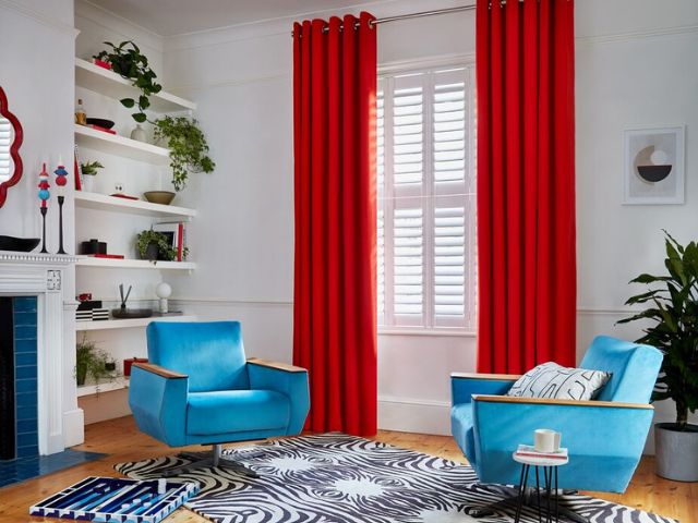
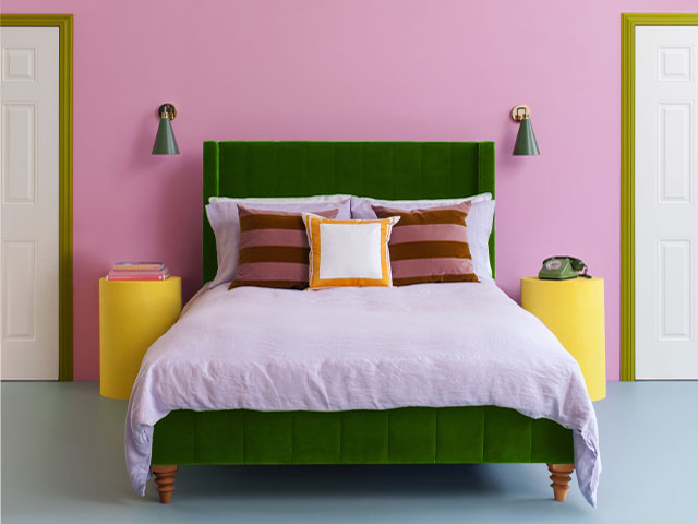
“Use your armchair as the focal point in bold blue velvet and complement with colourful accessories in yellow and pink.
“Layer two different shades of pink – such as blush and coral – to make the space feel grown-up and much more stylish than a traditional red, blue, and yellow combination.”

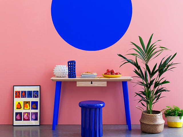
Try some colour blocking
If punchy accents don’t satisfy you, colour blocking is the way to go.
“Take your pick when experimenting with this paint technique – block out one or two feature walls, highlight a chimney breast or add a pop of colour contrast to your skirting boards,” Amthal suggests.
If you have built-in alcove units or shelving, you could also paint those in a bright colour of your choice to create a stand-out feature.
“The key to making this look cohesive is by finding complementary colours on the colour wheel and selecting shades that feel more sophisticated than their primary counterpart.
“For example, coral instead of pink and duck-egg blue instead of baby blue,” Amthal adds.
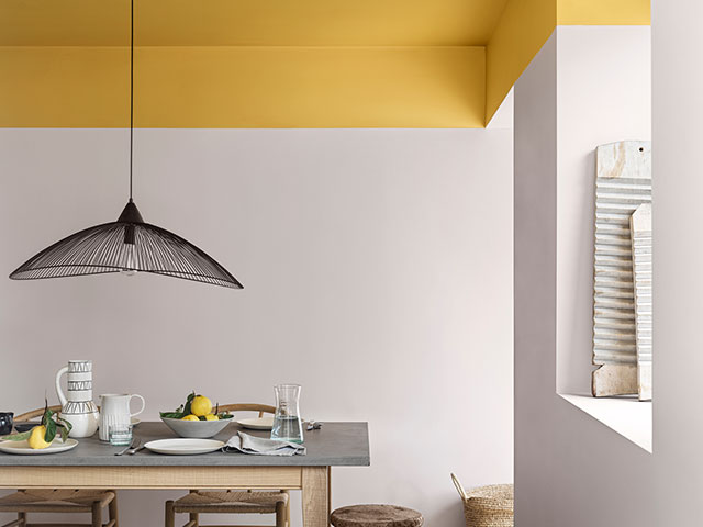
Inject some surprise colour
Colour blocking isn’t the only way to adopt Balamory-style interiors with paint.
Bailey Oates, colour expert at Earthborn says alcoves offer a great opportunity to be creative.
“If you’re unsure about using a bold shade for a whole room, a brightly painted alcove is an exciting way to introduce a pop of colour without overwhelming a space,” he says.
“Pair with equally bright furniture and artwork for a cosy space that draws the eye in.”
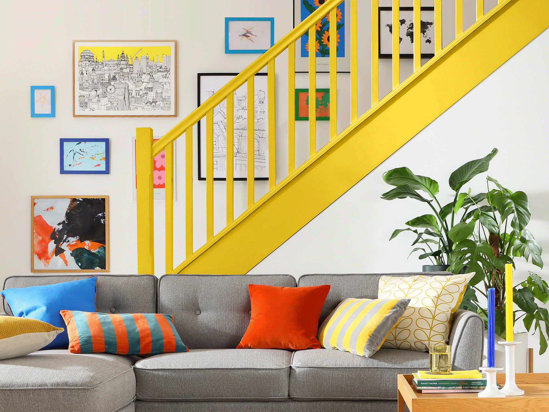
Another way to introduce colour and fun into interiors is to paint picture frames.
“Opt for different shaped, mismatched frames and hang together in a gallery-wall style for a ‘curated’ look that ties in with the rest of your colour scheme,” Bailey continues.
“Paint your frames in complementary tones or go for a contrasting shade to your wall colour for real impact.”
![[tag]](https://www.goodhomesmagazine.com/wp-content/uploads/2024/10/Furniture-And-Choice-Dopamine-Dcor-Office-Alcove-Brooklyn-Chair-Landscape-69.99-8374814-700x525.jpg)
Have fun with finishing touches
If repainting your entire home feels a step too CBeebies, you can inject a hint of Balamory‑style playfulness into your space just via using accessories.
A few colourful cushions on a neutral sofa, a quirky lampshade, or a bold piece of wall art can echo the show’s joyful palette of bright hues without overwhelming the room.
“A burst of colour instantly creates a sense of joy,” Magdalena explains.
“Think lively mixes of pinks, oranges, and blues that conjure up a sun-drenched, happy atmosphere.”
Florals are another brilliant way to bring drama into your styling.
“Statement blooms like tulips, peonies, or ranunculi look incredible when paired with understated, neutral tableware,” she continues.
Don’t shy away from pattern play, either.
“Striped runners, checked napkins, and colour-blocked plates layered together can feel wonderfully curated while still joyful.
“It’s all about introducing a sense of personality through these unexpected combinations.”
And for evenings, layer the tablescape with patterned candlesticks, twinkling fairy lights, and even solar bulbs to carry that warm, joyful glow into the evening.
“Colourful glassware brings a playful and timeless twist to traditional clear vases, glasses and champagne flutes,” explains Becca Stern, co-founder and creative director of Mustard Made.
“Buttery yellow tinted glasses, or a pastel tumbler collection, instantly brightens up the space with a cheerful touch.
“Or go bold with a dreamy colour combination like yellow and blush pink, or lilac and green to truly upgrade your dining experience.
“Display on an open shelf, a stylish drinks trolley or a retro locker and drink your favourite tipples in style,” she adds.
Ultimately, it’s about experimenting with vibrant hues, bold patterns, and striking accessories, whilst keeping the balance between fun and finesse.
“This means the look feels energised yet elegant,” Magdalena concludes.
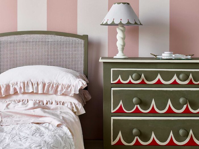
Layer patterns and textures
Maximalism is key to the Balamory look so don’t be afraid to mix florals, geometric prints, abstract shapes and playful motifs in the same space.
“To do this try combining different fabric styles such as a checkered sofa with striped curtains and a floral rug,” advises Debbie Leigh, design manager at ILIV.
“Create textural contrast by using a mix of velvet, boucle, cotton and silk and experiment with oversized prints on scatter cushions, pillows or throws.”
Be unexpected with window dressings
Patterned blinds or curtains in a joyful colour bring an element of surprise.
“Keep the rest of the palette calmer so they shine without overwhelming the space,” Adel Rozsa, interior designer and stylist at www.studionoer.com advises.
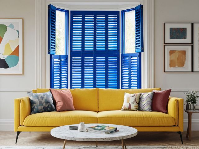
Victoria Robinson, Hillarys’ style and trend expert suggests painting window shutters in bright, contrasting colours.
“This a simple way to channel Balamory’s distinctive style and add instant curb appeal to your home,” she adds.
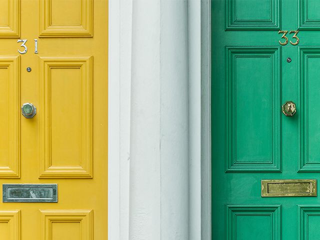
According to Adel painting the exterior of your home in a joyful hue – your door, the window frames or the whole facade – is a Balamory signature decor move.
Particularly as the much-loved show opens with rows of houses in pink, yellow, orange, blue, green and white, each one distinctly coloured to match its inhabitant.
“Painting the outside of your home in a cheerful colour — soft pink, sunny yellow, or sky blue — instantly lifts the mood,” he adds.
“Pairing these with natural materials or neutral trims keeps the look refined.”
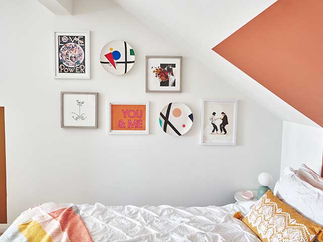
Play with art
A gallery wall that mixes an affordable print with an original piece or even a child’s drawing in a proper frame adds both surprise and soul.
“Art is high impact but low commitment – perfect for testing out boldness,” advises Adel.
To display your artwork more playfully, Ryan McDonough at MyJobQuote.co.uk advises thinking about painting plain frames with dots, squiggles and checks or painting the wall behind your pictures to frame your gallery area.
“If you want to mix things up a bit, why not throw a striped plate, painted tile or piece of contemporary embroidery into your gallery wall display?” he adds.
“You also don’t need to stick to the three primary colours to add a playful element, as greens, pinks and oranges also work well.
“Pastel colours and patterning in deeper shades can also add a touch of whimsy.”
Fun-up your furniture
A curvy silhouette or a statement chair in a bold hue can be both playful and sophisticated.
“Limiting it to one or two statement pieces per room ensures they add energy without chaos,” Adel concludes.
Looking for more interiors inspiration? Take a look at 12 ways to autumn-scape your home for the new season or Fashionable fungi: How to get the mushroomcore look in your home. And check out The Downton Abbey effect: 10 ‘Regencycore’ interior ideas that work in real homes
READ MORE: