


Summer paint colour trends for 2022
Sure, it’s harder to change your decor for the seasons than it is your wardrobe, but you can transform a room in a day with a good paint job. Before you consult a colour chart, take a look at Good Homes magazine’s pick of the summer paint colour trends for 2022. From sunset shades to new neutrals and bright wall mural ideas, these are the fresh, vibrant paint colours to try out now…
1. Sunset shades
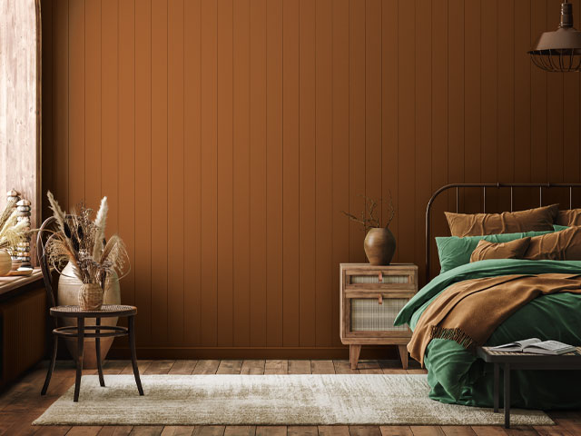
Long, warm evenings spent watching the sun set are what summer is all about, so it’s not hard to see why yellow, terracottas and reds are hot right now. Dulux ambassador Tabara N’Diaye has pounced on the latest collection of paints to create a sunny living room in her home, pairing Simply Refresh Blood Orange and Simply Refresh Blush Pink to create a bold and bright gallery wall to showcase her handwoven basket collection, as shown below. Dulux has launched the new Simply Refresh range of one-coat paints to help homeowners transform rooms in no time.
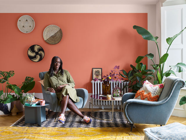
Tabara N’Diaye used Dulux’s Simply Refresh Blood Orange and Simply Refresh Blush Pink to create a summer sunset look
Every sunset starts with some shade of yellow. Below, Re:mix by Little Greene’s Yellow Pink 46 is a soft sunny shade that works perfectly with a grey sofa, mustard cushions and co-ordinated artwork. Re:mix by Little Greene is a new environmentally friendly paint collection created from left-over, unwanted and returned paints to create beautiful new paints for interior walls and ceilings. The upcycling of these waste paints prevents as much as 60,000 litres of high-quality mineral and organic raw materials from going to waste each year, making it perfect for an eco-friendly summer decor refresh.
Little Green Re:mix Yellow Pink 46
COAT has also launched a new collection of summer paint colours for on-trend decor jobs. ‘Our new colours are really exciting. They respond to exactly what people have been asking us for and by introducing colour families for the first time, it’s super easy to choose colours that work together in the same tonal range.’ For sunset-inspired paint jobs, try Mezcal, a warming pop of colour in an intoxicating blackened orange that feels effortless and works a treat with most other colours. If you’re looking for a contrasting shade, pair it with Arctic Roll, a bright yellow shade that will really give you that summery sunset look.
Mezcal by COAT
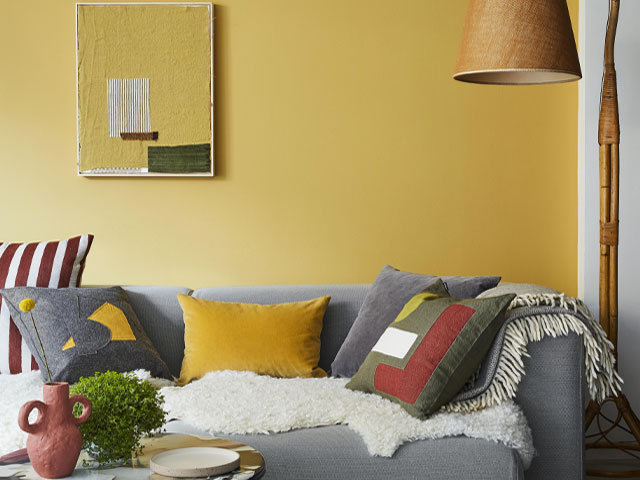
2. New neutrals
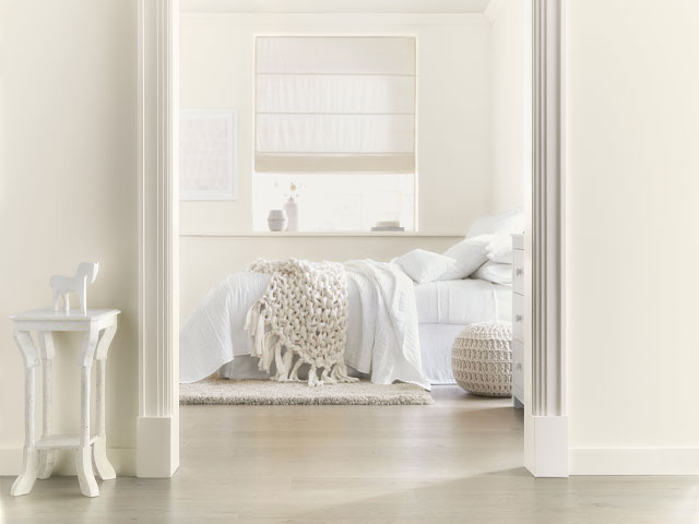
Summer paint colour trends are usually fresh and bright, but every decor project needs a neutral somewhere to anchor it. The new neutral is softer, more pebble than beige, more natural linen than white, as people look to add a softer side to their homes after experience a tense, difficult period during the global pandemic. Dulux ambassador Justin Coakley turned his bedroom into a tranquil oasis using two-tone neutrals: Simply Refresh Egyptian Cotton and Simply Refresh White Cotton. The effect is a cocooning and calm space, emboldened by monochrome accessories, where he can unwind and relax.
Dulux ambassador Justin Coakley used Simply Refresh Egyptian Cotton and Simply Refresh White Cotton to create a calming bedroom
‘Recently we’ve seen neutral shades go through a moment of serious re-appreciation, with their trusty, versatile, and of course calming nature,’ says Tobie Lewis, Senior Brand Manager at Valspar Paint. Shades such as Valspar’s Peaceful Taupe and Brushed Cotton are perfect for a neutral living room theme, for both layering with hessian and earthy textiles and contrasting with other non-neutral tones. If you want to add a hint of colour but keep the understated nature of a neutral theme in your space, soft green tones such as Cool Mint are great for incorporating a sense of freshness to more organic palettes.
Warming White from Valspar
COAT has also introduced a range of new neutrals to anchor your summer paint colour trends project, ranging from warm whites to the palest of lemons and deep beiges. Tuesday’s Child, shown below, is a gracefully light greige that’s bright and natural with a subtle green undertone, offering both warmth and freshness. Complement it with a darker greige, like COAT’s Debate Club, or contrast it with a rich brown like Sheldon.
Tuesday’s Child from COAT
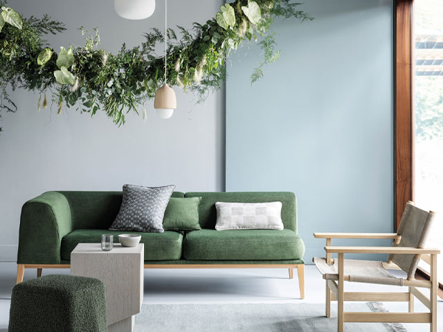
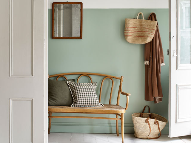
3. Blues & greens
Incorporating nature-inspired colours into our interior decor schemes has been a huge post-pandemic trend, chiefly born of our desire to reconnect with the outdoors after such a long spell cooped up inside. ‘Blue tones have a biophilic nature and therefore evoke a stress-relieving and mood-boosting atmosphere,’ says Will Thompson, Head Of Product Marketing at Valspar Paint. ‘Hazy, muted, and softer shades are all grounded in the natural world and encourage us to reflect and take a moment of calm. Whilst fresher more cleaner tones, such as teals and turquoises, encourage more light into a space, boosting serotonin and enhancing positive moods.’
Valspar Serene Scene
Beautifully crafted furnishings and a quiet palette of neutral tonal colour demonstrate an appreciation of the natural world,’ says Kathryn Lloyd, Crown Colour Consultant. Subtle tones of chalky aqua and soft greys create a feeling of airy openness, while deeper greens ground the palette, adding depth and definition. The result, especially when paired with wooden furnishings and natural textures, is a calming space that blurs the boundaries between the indoors and outdoors — a key summer trend — to soothe the mind and invite quiet contemplation.
Needles & Pins and Curiosity, both Crafted by Crown
Building on the blue-green summer paint colour trends is the gorgeous blue-grey shade from COAT, shown below. Free Range is pretty, clean and relaxed with subtle grey undertones. It works beautifully when paired with a slightly deeper blue-grey shade called Lie In, alongside natural materials and wooden furnishings, as shown in the image below. This look is perfect for those who love a grey kitchen, but want something a little fresher that won’t date.
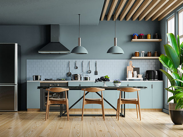
COAT’s Free Range paired with the deeper shade of Lie In
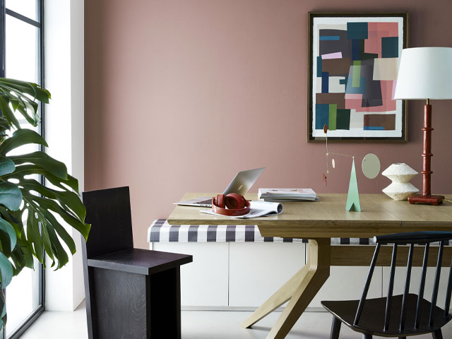
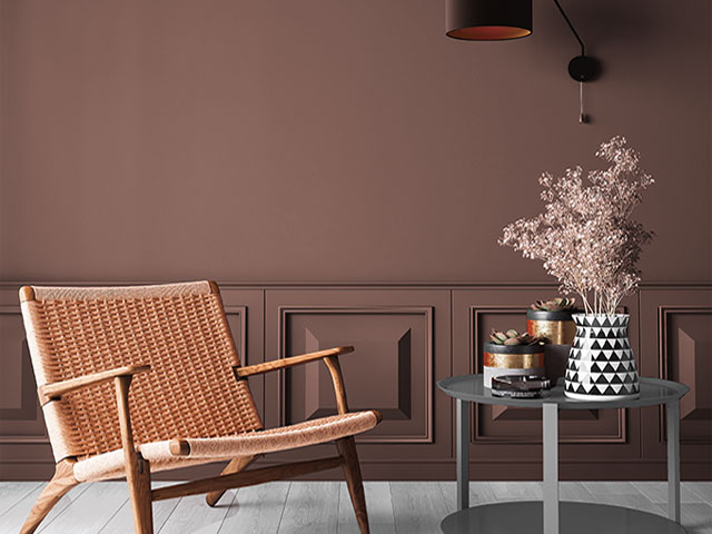
4. Pinks
The return of Bridgerton at the beginning of 2022 spawned a new colour trend — Bridgerton Pink. Softer, warmer and less vibrant than Millennial Pink, Bridgerton Pink is more of a plaster-meets-pale-terracotta-with-a-hint-of-coral shade of pink. But if you’re not afraid of decorating using a tonal scheme, then there’s no reason you can’t explore blush shades and pastels as part of a Bridgerton Pink decor scheme.
For a softer take on pink decor, look for muted, blush tones, like Nether Red from the Little Greene Re:mix collection, shown below in this contemporary dining room. Pair the shade with a pale neutral for an even softer look, and keep furnishings modern and pared back to prevent the look pink decor schemes from tipping over into chintzy.
Re:mix Nether Red 315 and Slaked Lime 105
‘Decorating with pink can come with a lot of apprehension but you should feel confident using such a fun and romantic colour in bedroom interior plans,’ says Tobie Lewis, Senior Brand Manager at Valspar Paint. ‘The 1970s retros trend is bringing the shade back into fashion, pairing them with mustard yellows and burnt oranges, as well as teal greens for a real sense of fun in your bedroom décor. Try colour drenching your walls in a dusty shade like Serengeti Fire and closely match your skirting boards and doorframe in a similar, but slightly lighter tone, like Yoga Pose to help define the room and give your space a soft yet fun energy.’
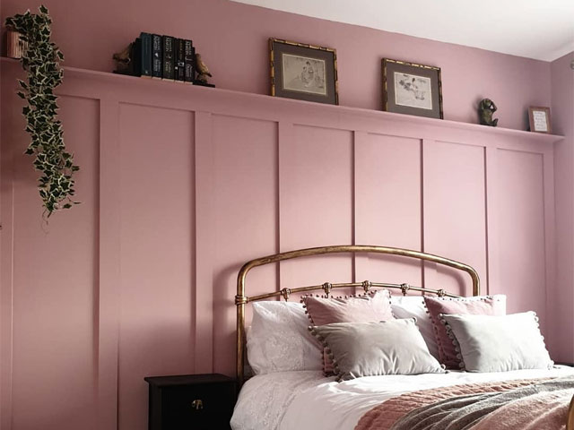
Valspar Brazilian Rose. Photo: @our_yorkshire_acacia
For a more grown-up, sophisticated look, try a darker, dusky pink with plumy tones like COAT’s Mrs Bouquet. This elegant and sophisticated deep blush pink creates a bolder scheme that is still soft and feminine. Curved furnishings will keep the look soft and welcoming. Why not add boucle pieces in off-white shades? Try this shade in a room with plenty of light, or to demarcate a cosy reading nook or a do-not-disturb retreat space where you can unwind at the end of a busy day.
Mrs Bouquet from COAT
5. Bold paint jobs
‘Now is the time for us all to emerge into a bright and glorious interior design future that is above and beyond grey,’ said Lawrence Llewelyn-Bowen during a talk at Ideal Home Show 2022. Crown colour expert Chrissi Baldwin echoed this sentiment during her Ideal Home Show talk: ‘Feature walls are still really fashionable, but this year you want to think out of the box a little bit. Instead of white skirting boards and coving, take the colour right from the floor up the ceiling and over. Your home is a reflection of who you are, if there’s a colour that you love, work that into your decor scheme.’
Dulux ambassador Amanda Cotton transformed her previously plain home office, creating a striking mural in record time using the Simply Refresh one-coat range. She chose shades of Golden Sands, Blood Orange, Denim Drift and Jasmine White and set to creating a bespoke wall mural. Take note – the ceiling is not off limits! Continuing your designs up and over to make the room look bigger.
Dulux ambassador Amanda Cotton created a bespoke wall mural in her home office using the Simply Refresh one-coat range in Golden Sands, Blood Orange, Denim Drift and Jasmine White
Crown launched a palette of playful pinks with a softer, tonal feel in 2022. Here, deeper pinks meet blush tones and muted amethyst, while curved furnishings and free-flowing wall mural designs keep the look soft and welcoming. Pops of neon citrus add an element of surprise that echo that neon vibe. ‘Romantic hues of blush rose and raspberry swirl and layer colour upon colour,’ says Jemma Saunders, a Crown colour specialist. ‘Inspiration is drawn from the free-flowing Surrealism art movement and the cute, stylised culture of kawaii [the Japanese youth culture of cuteness].’
Made with Love, Cross Stitch, Music Box and Softly Does It, all Crafted by Crown
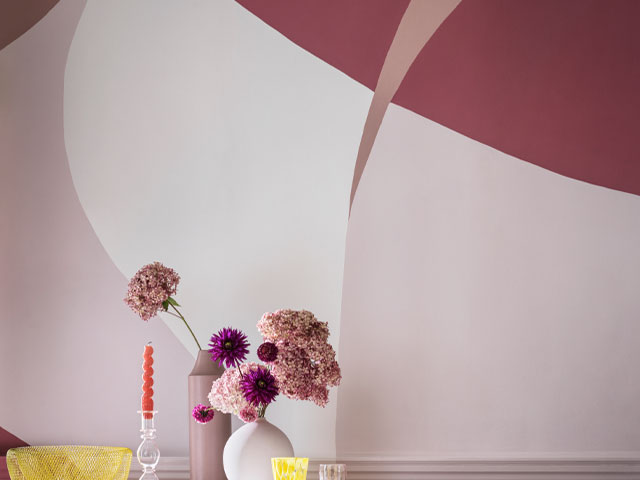
Those looking to really embrace summer paint colour trends for 2022 should be bold and brave. A great way to experiment with colour in the home is to create your own wall art using clashing paint colours. The look shown below is created by painting and framing bold, graphic prints and mounting them on the wall. This way, you don’t have to commit to one bold colour and you can switch out the designs as you please. It’s a much more daring and fun way to tackle a feature wall.
Artwork and frames painted in Witty, Satin Lining, English Fire, Mustard Jar, Powder Blue and Dance Fever, all from Crown
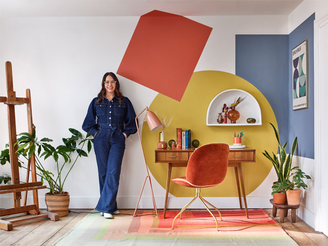
How to choose the right paint colours for you
‘Sometimes it can be difficult to find that inspiration or spark,’ says Marianne Shillingford, Creative Director at Dulux. To help inspire homeowners to be brave with colours, she offers her expert advice:
- Choose colours that make you happy rather than pleasing the crowd
- Add a pop of colour to your feature wall by painting simple shapes in your favourite shades
- Save money and buy 250ml tester pots for smaller details and shapes
- Use Dulux Simply Refresh paints if you want colour to come to life in double quick time – it covers in one coat so you can really get cracking with the creative details
- Chalk out shapes using kids chalk and keep standing back to check how it looks before filling in the colours
- Use good quality acrylic paint brushes and have some artist brushes for the finer details
- Invest in a roll of bendy making tape — a must-have for big curved shapes
- Painting with friends makes any decorating fun rather than a chore
- Be kind to the environment by using solvent-free paints, buying just enough for the job and donating leftovers to others