bridgerton pink bed linen
How to create a ‘Bridgerton Pink’ interiors scheme
Binge-watching Bridgerton season 2 and keen to replicate the elaborate Regencycore interiors in your own home? There’s one colour you need to bear in mind before starting your scheme – ‘Bridgerton Pink’.
According to luxury interior experts at Celina Digby, there has been a dramatic shift in the colour palette since Bridgerton season 1.
‘Last season, Wedgewood Blue had an iconic presence throughout each episode’s interiors, due to its synonymy with English fine china. However, this year there has been a dramatic shift,’ says Nicole France, a spokesperson for Celina Digby.
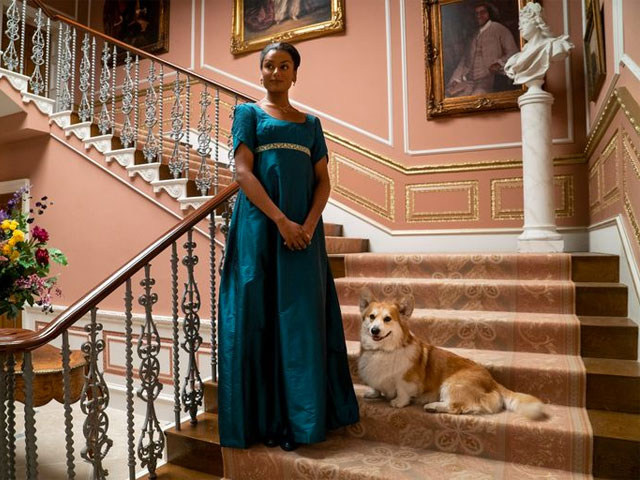
Kate Sharma, played by Simone Ashley, in Lady Danbury’s pink house in Bridgeton. Photo: Netflix
Warmer tones
The Bridgerton and Featherington estates were largely made up of creamy hues, greys and powder blues and greens in season 1, but in season 2, says Nicole, ‘warmer tones have taken centre stage, particularly in the new Sharma household’.
‘In fact, this season is strikingly warmer to the eye than the first – and that applies to many of the new character’s costumes as well as interiors and garden design. In the central Sharma household, Pink Champagne is dominant and used throughout the interior on curtains, carpets and wallpaper,’ says Nicole.
‘Pinks are very in right now, and also work exceptionally well alongside it. Try blush or damask alongside champagne for an especially luxurious feel.’
Classic panels wallpaper mural from wallsauce.com, paired with a Regencycore-style pink sofa
Bridgerton Pink
Softer, warmer and less vibrant than Millennial Pink, Pink Champagne, or Bridgerton Pink, is more of a plaster-meets-pale-terracotta-with-a-hint-of-coral shade of pink. But if you’re not afraid of decorating using a tonal scheme, then there’s no reason you can’t explore shades of blush, pastel and other shades as part of your Bridgerton pink decor scheme.
‘And just as we saw in the first season, there is one colour tying it all together – this season, it is champagne,’ adds Nicole. ‘We see champagne consistently surfacing within Bridgerton’s second season interiors, as well as the costumes and motifs.
‘The home features Warm Champagne accents in details like wallpaper patterns, furniture legs and picture frames. This creates a beautifully elegant and strikingly warm effect – much warmer to the eye than most of the first season’s interiors.’
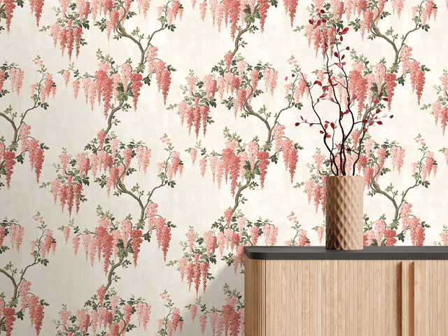
Wisteria wallpaper in coral from Woodchip and Magnolia
How to decorate with pink
But working with pink can be intimidating, LuxDeco 100 architect and designer Natalia Miyar, a self-confessed lover of pink, offers some tips for putting a sophisticated spin on pink, in true Lady Danbury style…
Which colours compliment pink interiors?
My personal favourite is white with pink. A subtle trick you can use to bring these together is to select a white with an undertone in the same shade. I also use a lot of grey and pink with accents of black. This helps to move away from the girly look sometimes associated with the colour. Mixing pink with cream and peach can also look super feminine but incredibly grown-up.
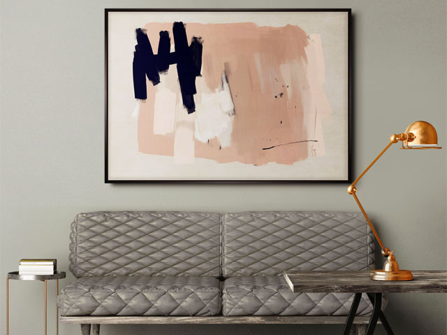
Marrakech painting featuring pink, cream, peach and black from Lux Deco
How do you make a pink room elegant?
Pink can be extremely elegant. There are many pink tones to choose from, and the key is to choose something that does not have an affiliation with a particular style but stands out for being different.
If you are going heavy on pink, my advice is to start by choosing your tone and let that guide your material choices, furniture and accessories. If you are aiming for elegance, you need to get all these components right to create the desired atmosphere in your room.
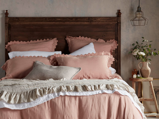
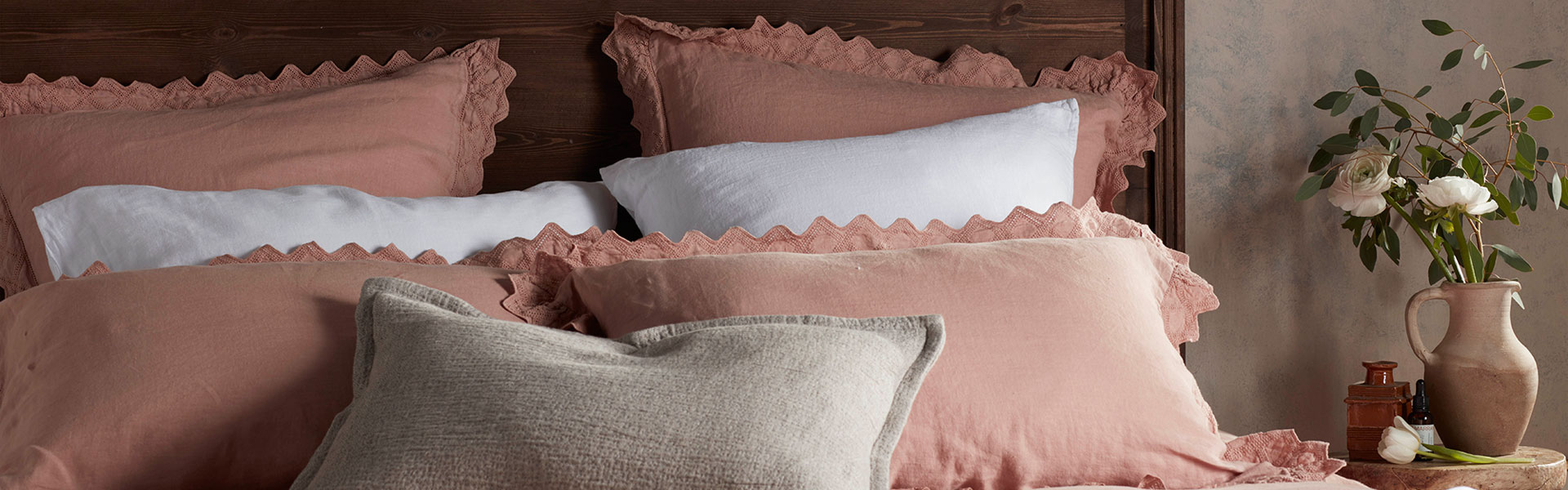
Violet Cameo Pink 100% linen bedding from The Secret Linen Store
How to master a pink room that’s not too feminine?
Anchor your room with bold style statements for drama when using pink. We use the same trick when throwing a leather jacket over a flowery dress.
For me, black works well as an accent in many colour schemes and goes particularly well with pink. If you have something feminine in your room, work in something that will contrast with that.
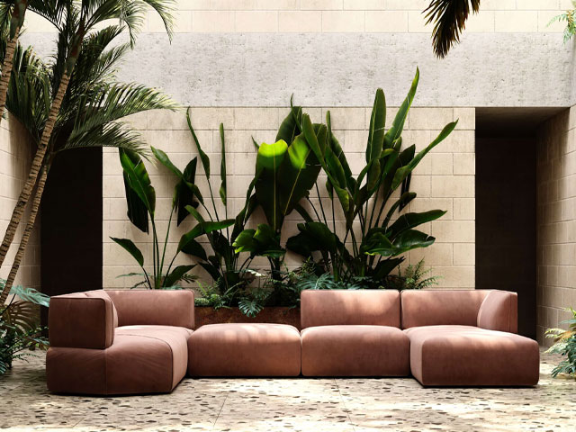
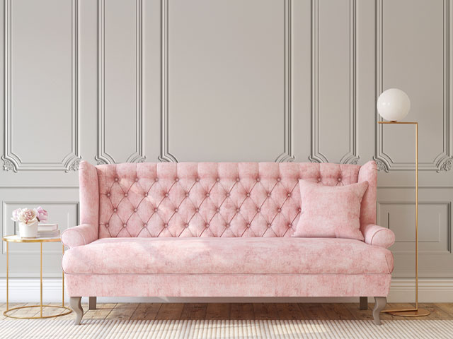
Disruption corner sofa in velvet blush from Lux Deco, set against a backdrop of natural materials and neutral colours
RELATED ARTICLES
- Bridgerton-inspired home décor: how to get the Regency look
- Floral home décor: 9 ways to work the trend
- How to style a pink bedroom