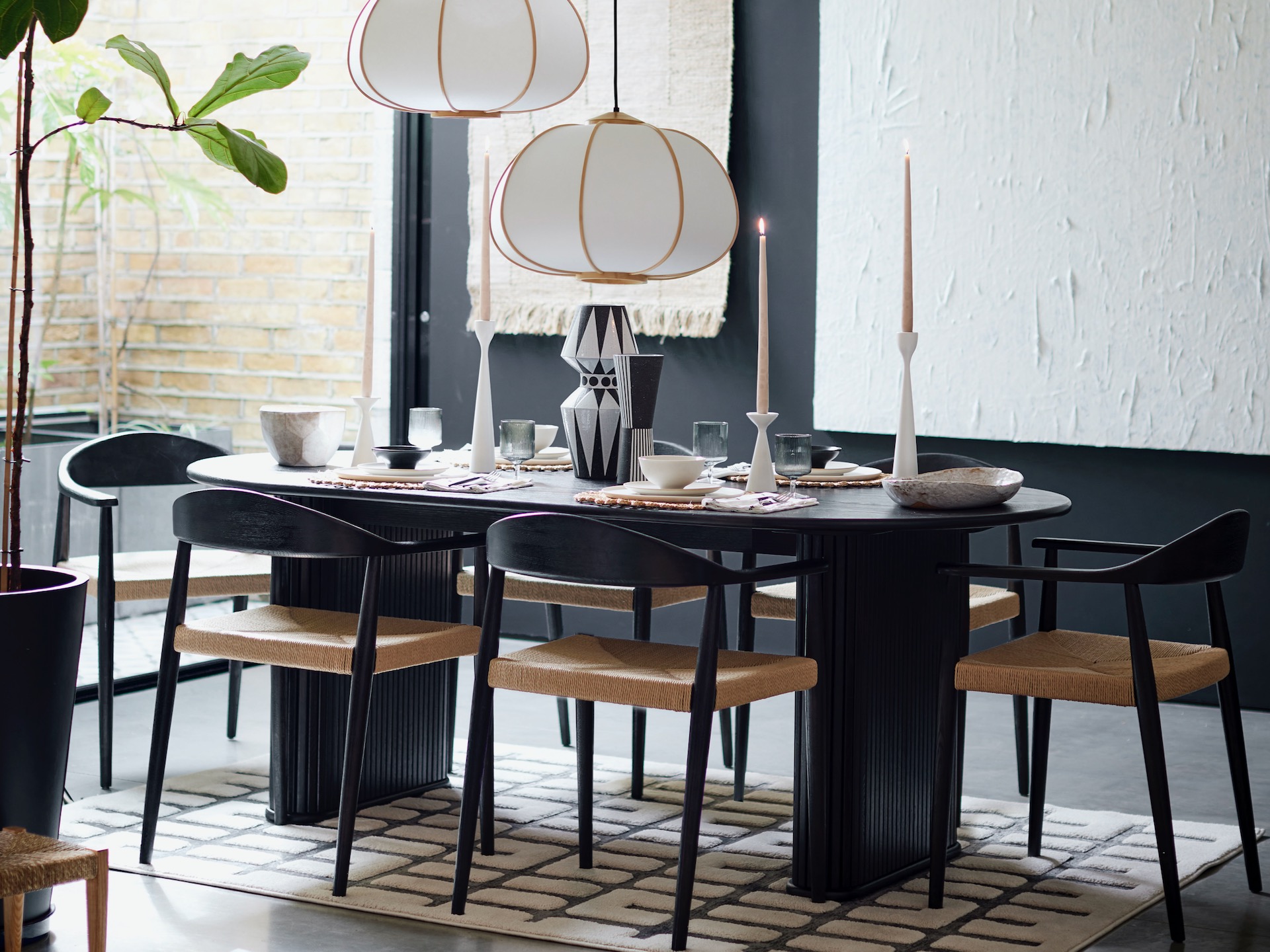
In this dining room with furniture by DFS, a few carefully chosen details such as the woven seats and gold-trimmed lighting, ensure the space feels welcoming
Are you making these monochrome decorating mistakes?
What’s black and white and stylish all over? Our homes, that’s what. The chessboard palette has emerged as a huge interiors trend this season. Yet this leaves us vulnerable to monochrome decor mistakes that are all too easy to make.
Before we dive in to the subject proper, it’s probably worth defining what we mean by a monochrome palette. Because monochrome essentially translates from its ancient greek roots as ‘one colour’ – so you could technically apply it to a look that’s all-red, all-blue, all-green etc. However, in this instance, we are talking monochrome in the sense of a scheme that’s black and white.
It’s easy to see why we’re charmed by this simple combination.
“Black and white is a powerful design decision that transcends eras, bringing sophistication, contrast and a sense of balance to interior spaces,” says Tom Dixon, managing director of wallpaper retailer Beautiful Walls.
“Plus, both colours are effortlessly chic and extremely versatile, whether homeowners choose to pair them together or use them as blank canvases around which to build the rest of your interior scheme.”
Add to that, it’s the perfect palette to conjure up the quiet luxury look that we craved through 2023. But where might we get our styling wrong? And, more importantly, how do we put it right?
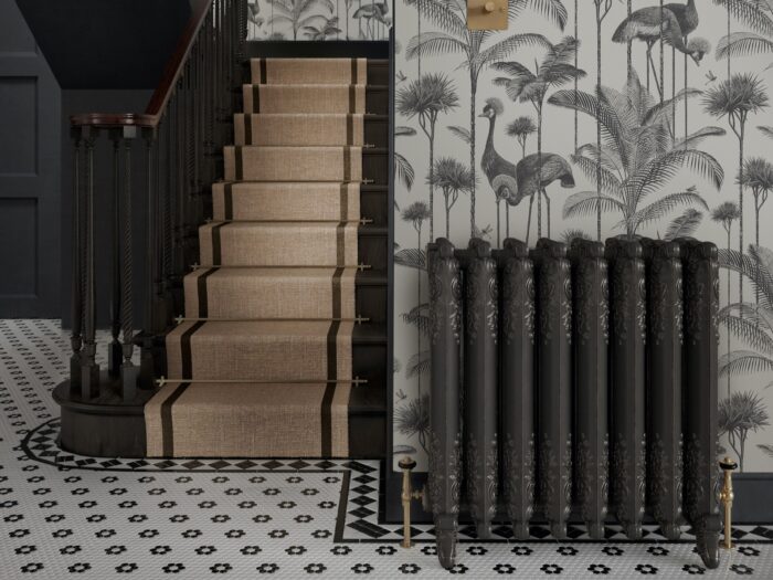
Sticking to the same texture
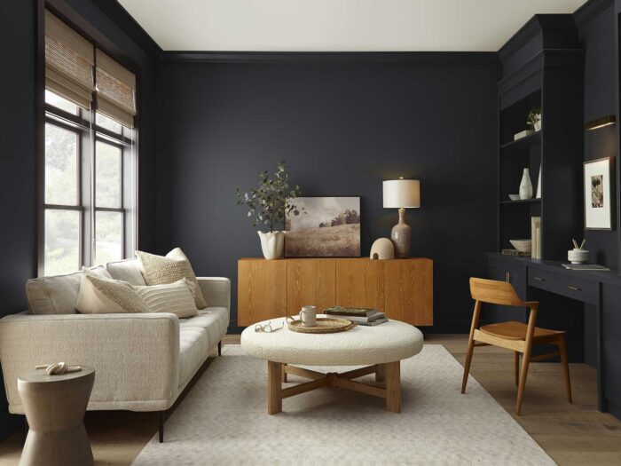
We’ve put this first as it’s the biggest no-no of a black-and-white look. Most others are easily fixable, but if you invest in a bathroom that’s head-to-toe monochrome gloss, or a kitchen that’s a matt-textured black and white from floor to cabinets to worktops, it’s unlikely to work. In fact it’s either going to look stern and clinical, or flat and old-fashioned.
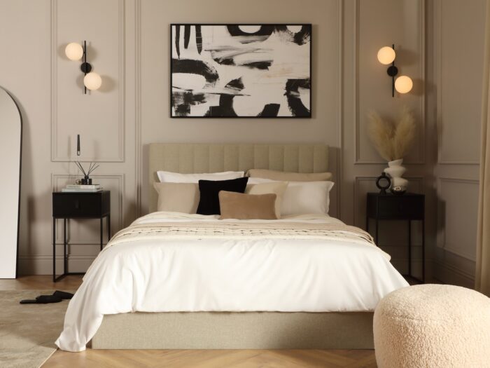
The first trick to getting monochrome right is to introduce a whole gamut of textures. In a bedroom, this could be a velvet headboard or white-washed wooden bed frame versus crisp white cotton sheets, a chunky wool throw and a boucle armchair.
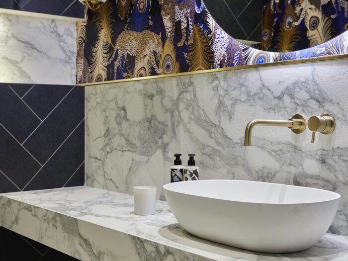
It can be especially tricky in a bathroom, but ‘queen of neutrals’ Kelly Hoppen has a few clever solutions. Speaking at the launch of her Kelly Hoppen x SV CASA collection, exclusive to LuxDeco, she suggests: “Adding marble touches is a favourite of mine as it adds soft tones and natural glamour. This could be as simple as adding soap dishes and toothbrush holders.
“Another key touch is to add luxury taps. Whether you go for a statement brass colour or a classic silver design, I advise investing in quality fixtures. Finally, all rooms should have multidimensional aspects and a big part of this is scent. Candles and flowers can not only change the appearance of a room but the scent adds a whole other level to a space.”
Ignoring Mother Nature
Another way to prevent a monochrome look from becoming cold and sterile is to layer in neutral tones or greenery – good news for houseplant enthusiasts. It’s a time-honoured approach – think how well seagrass and wicker work with a crisp coastal white, for example. However, you can still get this wrong, so choose your palette carefully.
If you’ve gone for warmer undertones (so a barley or creamy white as opposed to a brilliant or greyish white base), you can add timber, cane and rattan in honeyed shades. If you’ve gone for a cooler palette, it’s better to go with a pine or ash with a greyer tone, a treated wicker, or a very strong dark brown. An ebony or dark walnut would look stunning against a jet black.
And here’s an additional tip – never mix undertones. Go for warm or cool in a room, but never both.
Going too big, too soon
Our final tip if you’re trying monochrome for the first time, is to start small. The best places to experiment are a hallway, ensuite, cloakroom, utility or spare room. If you’re unsure, that open-plan kitchen-diner-living room could easily end up looking like a warehouse rather than the warm and welcoming entertaining space you’d planned. Small equals cosy, so you’ve got a better chance of achieving a balanced look from the off.
Build confidence in that small space, experimenting with mirrors and lighting to set just the right tone, and you’ll be ready to upgrade elsewhere.