


Image Credit: Dulux
Colours of the Year we know so far: shades set to shape our homes in 2027
Once upon a time, Pantone’s Colour of the Year was the big annual colour reveal.
Now, paint and interiors brands are busy unveiling their own headline hues, giving us a whole palette of colours tipped to shape the way we decorate our homes over the coming year.
But these special shades aren’t simply plucked from thin air.
Brands spend months studying everything from emerging interiors and fashion trends to shifts in the way we live and how we want our homes to feel, before landing on the colour they believe captures the mood of the moment, and what’s coming next.
“Our in-house design team works a year ahead, closely monitoring lifestyle and interiors trends to anticipate the colours and styles that will resonate with our community and the interiors industry,” stylist, Paula Taylor, says of how Graham & Brown’s Colour of the Year was chosen.
And while nobody’s suggesting you need to redecorate the entire house every time a new shade drops, COTY can be a brilliant source of inspiration.
They often filter into the palettes, products and decorating ideas we’ll be seeing everywhere, whether that’s a comforting neutral, an uplifting bright or a colour we’d never previously considered putting on our walls.
So, which shades should be on your radar for 2027?
We’ve rounded up the colours revealed so far and spoken to the experts behind the picks to discover why they chose them.
And, more importantly, how to make them work beautifully in your own home.
Rose Earth – Graham & Brown
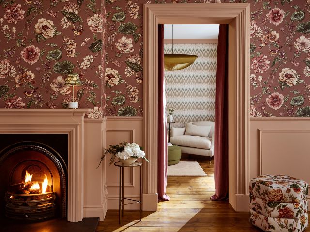
Graham & Brown has named Rose Earth as its Colour of the Year for 2027, a soft, earthy pink that combines the warmth of terracotta with the understated elegance of a neutral.
Inspired by natural mineral pigments traditionally sourced from Italian clay deposits, this comforting, chalky shade taps into our growing appetite for warmer, more inviting interiors as cooler colour schemes take a back seat.
“We began seeing a strong shift towards warmer and earthier tones, which helped select Rose Earth as our Colour of The Year for 2027,” Paula explains.
“As consumers move away from cooler schemes, we’re seeing an increasing appetite for colours that bring comfort, warmth and authenticity to the home.
Rose Earth captures this shift perfectly, combining the natural warmth of clay-inspired tones with a timeless elegance that works across a variety of styles and spaces.”
Get the look at home
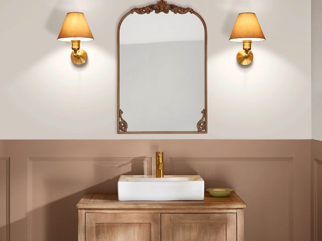
Paula says Rose Earth is a great colour to style!
“You can pair it with organic materials such as wood, stone and linen, alongside soft sage or olive greens colours that can also be found in our new Autumn Winter Verdant Atelier collection, to create a beautifully calm and restorative atmosphere,” she says.
But the soft earthy hue is equally impactful when used as a standalone shade.
“For a beautifully immersive scheme, embrace colour drenching by enveloping walls, woodwork and ceilings in the shade,” Paula continues.
“Alternatively, colour capping offers a cocooning effect, drawing the eye upwards and enhances the warmth and depth of the space.”
Country Soil – Johnstone’s Paint
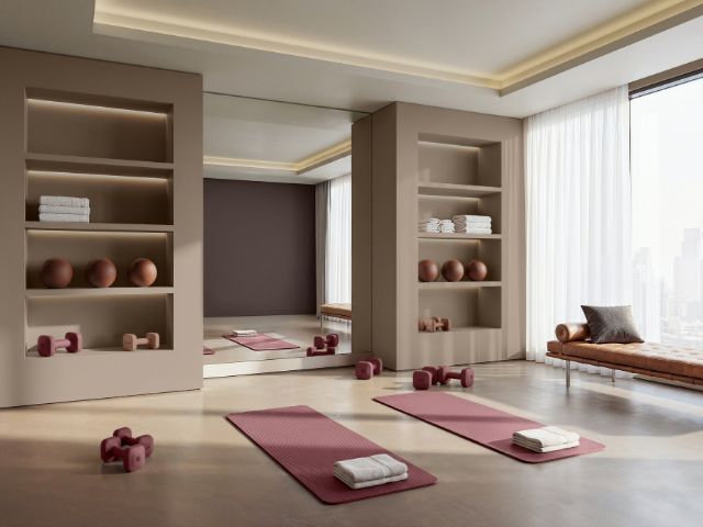
Johnstone’s Trade has unveiled Country Soil as its Colour of the Year for 2027, a rich, earthy neutral that blends beige, taupe and grey to create a shade that feels both warm and grounding.
Inspired by the colours and textures of the natural world, it brings a sense of comfort, balance and timelessness to a space, making it incredibly versatile throughout the home.
“We chose Country Soil as our 2027 Colour of the Year because it reflects a growing desire to create homes that feel calm, restorative and connected to nature,” explains Donna Taylor, colour and design manager at Johnstone’s Paint.
“As our lives become increasingly busy and fast-paced, many people are looking to turn their homes into spaces that offer comfort and sanctuary.
“Country Soil captures this shift perfectly, offering warmth, familiarity and a sense of quiet confidence.”
While its name might conjure up images of rustic country cottages, Country Soil is just as at home in a contemporary setting.
Adapting beautifully to different styles and changing natural light, Donna says the shade brings depth and character without overpowering a space, making it a use-anywhere choice for everything from cosy living rooms to restful bedrooms.
Get the look at home
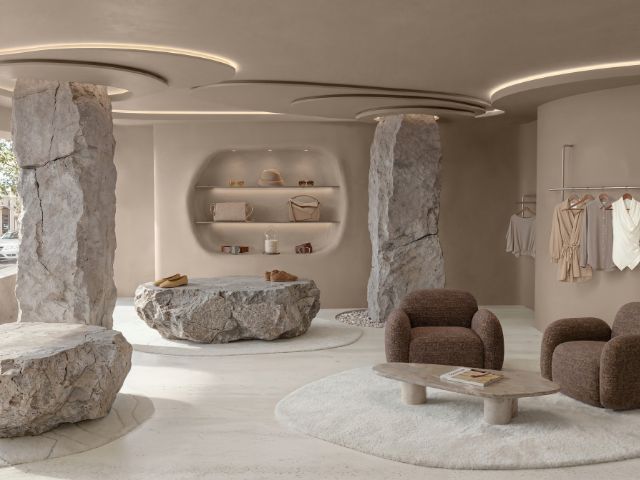
To create a calm and comfortable space using Country Soil Donna suggests adding depth as an earthy accent.
“Rather than limiting the shade to a feature wall, consider using it on alcoves, shelving or a chimney breast to create a cocooning effect and bring warmth to a room,” she explains.
She also recommends layering natural textures and pairing Country Soil with oak furniture, linen fabrics, wool throws and handcrafted ceramics to create a welcoming, lived-in feel.
“Use the shade with soft lighting,” Donna continues.
“Warm table lamps and ambient lighting help enhance the richness of the shade and create a relaxing atmosphere, particularly in living rooms and bedrooms.”
When it comes to colour pairings, Donna says Country Soil’s versatility means it can work with a variety of palettes.
“For a light and airy look, pair it with porcelain, ivory and soft linen tones,” she suggests.
“A nature-inspired scheme will work mixed in with olive, sage green and muted khaki shades.
“And for a more contemporary take combine the grounding hue with dusty rose, clay pink or peachy-beige accents to add warmth and softness,” Donna adds.
Marle – Little Greene
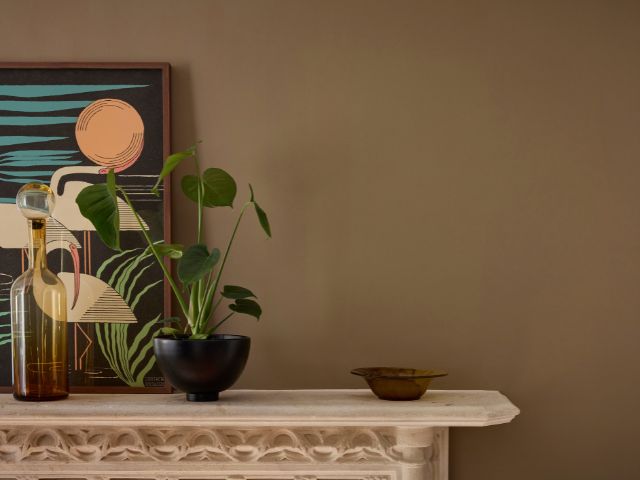
Little Greene has chosen Marle, a warm, mid-tone brown, as its Colour of the Year for 2027, tapping into our love of cosy, cocooning interiors but with a more understated approach to colour.
While we’re still craving homes that feel comforting and nurturing, the brand says it has spotted a growing shift towards softer, more balanced shades that bring personality to a room without making too much of a statement.
And that’s where Marle comes in.
Rich in character but without the intensity of a deeper brown, it’s a quietly confident shade that offers all the warmth and reassurance of an earthy neutral, while bringing a little more depth and interest to our decorating schemes.
“Our Colour of the Year 2027, Marle, is a versatile shade that will warm cooler spaces and breathe life into darker rooms as well as set the scene for harmony and tranquillity,” explains Ruth Mottershead, creative director at Little Greene.
But don’t be confusing Marle with the dated browns of your mum’s 70s bedroom, this shade has had something of a modern makeover.
“Gone are the associations of dated 1970s interiors, drab or dull spaces, it’s wonderful to see browns such as ‘Marle’ re-taking their rightful place in contemporary interiors,” Ruth continues.
“This perfectly balanced, complex and captivating hue provides a warm, comforting backdrop that makes it ideal for ‘all-over’ schemes or colour drenched rooms.”
Get the look at home
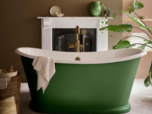
Ruth says mid tone browns like Marle can be calmly cocooning when colour drenched across all elements within a space including all four walls, panelling and woodwork for a truly impactful, cosy finish.
“Marle also works well within a ‘demi drench’ scheme,” she continues.
“This is a new approach to layered colour, which sees colour carried across walls and woodwork, but only up to a defined point, with a lighter or tonal shade applied above.”
Ruth says this technique creates a sense of architectural interest.
“It can also imitate architectural details where there may be none, such as a picture rail while also altering the perceived proportions of a room,” she adds.
The growing versatility of mid-tones also makes them particularly easy to combine with other colours.
“Pair them with similar tones for a cohesive and harmonious scheme, or use them alongside bolder accent colours to provide balance, grounding a scheme and preventing stronger colours from feeling too dominant,” Ruth suggests.
Soulful Sage™ – Dulux
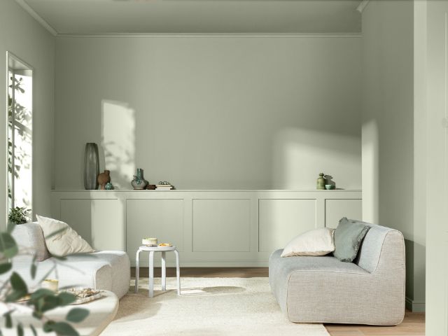
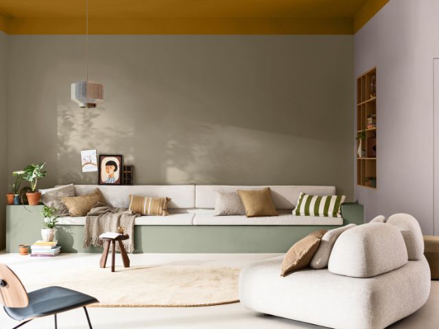
Dulux has revealed Soulful Sage as its Colour of the Year for 2027, a soft, silvery green that offers a lighter, more delicate take on the nature-inspired shades we’ve been loving in recent years.
Fresh and calming without feeling cold, it’s a colour that brings a little of the outdoors in while being subtle enough to work almost like a neutral.
“Soulful Sage really reflects what we feel people are looking for in their homes right now,” explains Marianne Shillingford, creative director and colour expert at Dulux.
“Life can feel incredibly busy and information-heavy, so we increasingly want our homes to provide a counterbalance – somewhere we can slow down, switch off and create a little breathing space.”
The shade also ties in with Dulux’s 2027 theme, Live Lightly, which is all about creating homes that help us feel lighter, too.
And thanks to its subtle ethereal undertones, Soulful Sage changes character as natural light shifts throughout the day, bringing gentle colour and interest without overwhelming a room.
Get the look at home
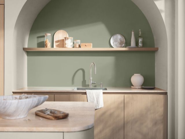
If you’re ready to embrace Soulful Sage, why not go all in?
“Use Soulful Sage across all four walls to create a soft, enveloping backdrop,” suggests Marianne.
“It has enough colour to give a room personality, while its barely-there quality means it still feels incredibly easy to live with.”
For a smaller update, try painting an alcove, the back of a bookcase or a tired piece of furniture. Alternatively, give your woodwork some attention by using the shade on skirting boards, doors or window frames instead of traditional white.
Marianne says the hue can also be used to zone a space.
“In an open-plan room, try using a block of Soulful Sage™ behind a desk, dining area or reading corner to visually define the area,” she suggests.
“It’s a really simple way to give a multifunctional room more structure without needing furniture or physical dividers.”
And don’t forget the fifth wall. “Taking the shade from the walls onto the ceiling can blur the boundaries of a room and create a wonderfully soft, cocooning effect,” Marianne explains.
“This can work particularly well in bedrooms or smaller spaces where you want to create a greater sense of calm.”
When it comes to colour combinations, there’s plenty of room to play.
For a cosy, cocooning scheme, Marianne suggests pairing Soulful Sage with earthy shades such as Clay Walls, Cinnamon Sprinkle and Spiced Honey.
Prefer something more pared-back? Whispered Blue and Ashen White will keep things feeling light and restful.
Or, for a more playful look, take inspiration from the brand’s Lift palette, which combines Soulful Sage with warm Taupe Pink, sunny Honey Bear and richer Fern Forest green.
“One of the things we love most about Soulful Sage is its versatility – the colours you put around it can completely transform its personality,” Marianne adds.
A Soulful Home – Lick
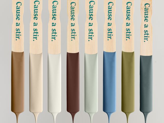
Why settle on one Colour of the Year when you can have eight?
That’s the thinking behind Lick’s A Soulful Home palette for 2027, a collection of warm, rich and characterful shades designed to work together or in smaller combinations to create different moods throughout the home.
From soft Pink 14 and creamy White 03 to bold chartreuse Green 23 and indulgent, oxblood-inspired Red 07, the palette taps into a growing shift away from cooler, flatter neutrals towards colours with more warmth, depth and personality.
“For me, colour is emotional, not just visual, and that’s one of the biggest reasons why at Lick we don’t choose one single Colour of the Year,” explains Tash Bradley, director of interior design at Lick.
“We also never really experience colour in isolation. We experience colours in combination with one another, alongside materials, furniture, artwork, light and all the things we collect throughout our lives.”
And rather than striving for picture-perfect interiors, Tash says the palette is all about creating spaces that feel personal, comforting and lived-in.
“A soulful home isn’t about creating the perfect interior.
“It’s about creating a home that tells your story.”
Get the look at home
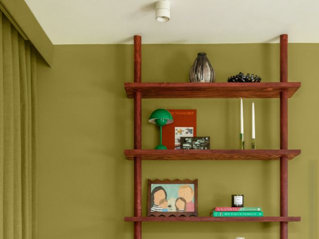
The beauty of Lick’s palette is that you don’t have to embrace all eight colours to get the look. Instead, choose combinations that reflect how you want a room to feel, whether that’s calming, uplifting or cosy and cocooning.
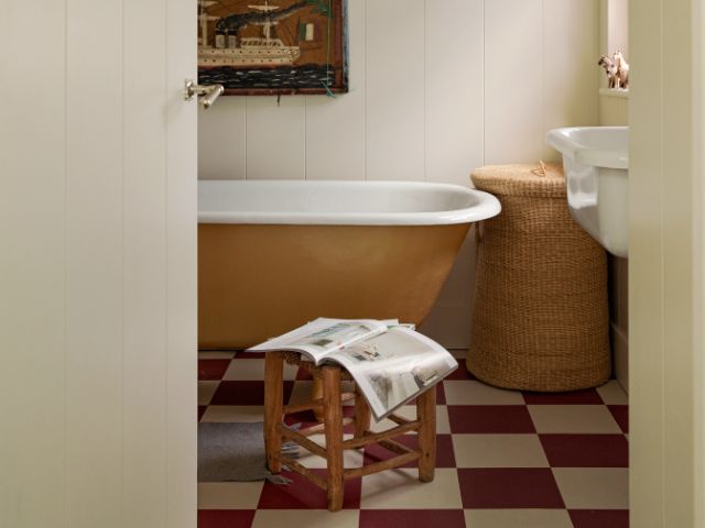
For a softer scheme, look to the delicate Pink 14 and warm, yellow-undertoned White 03, which offers a gentler alternative to brilliant white. Feeling braver?
Chartreuse Green 23 brings a vibrant, slightly nostalgic hit of colour, while the deep, chocolatey tones of Red 07 are perfect for creating a cosy, enveloping feel.
And don’t be afraid to mix things up.
The idea is to layer colours alongside favourite furniture, artwork and collected treasures to create a home that feels unmistakably yours, rather than something straight out of a showroom.
“Our homes host our lives,” explains Tash.
“They hold our memories, the things we collect, the people we love and the experiences we have within them.
“Colour can be an incredibly powerful tool for creating spaces where you feel utterly and truly yourself.”
Want more inspiration? Read: Strictly is back! 10 ways to bring razzle-dazzle into your interiors and Bake off is back! 8 ways to channel the tent in your own kitchen. And check out Practical Magic interiors: 10 magical ways to incorporate the whimsical look at home
READ MORE: