


colour drenching navy chaise from next with navy walls and blue rug
What is colour drenching?
Colour drenching is a no-holds-barred approach to decor that takes one colour and runs with it. The trend, which has been gathering pace since the term was coined in spring 2022, is a tonal approach to decor that sees devotees weave lighter and darker shades of the same colour through their scheme.
And we’re not just talking paint colours. Colour drenching involves matching your sofa to your walls, as well as your cushions, rug, decorative accessories and wall art. But not in matchy-matchy kinda way. Rather than going for everything in the exact same shade, you need to think tonal.
If you have a favourite colour that repeatedly finds its way into your wardrobe and home interiors, you’ll love colour drenching. Good Homes takes a closer look at the trend…
Colour drenching ideas
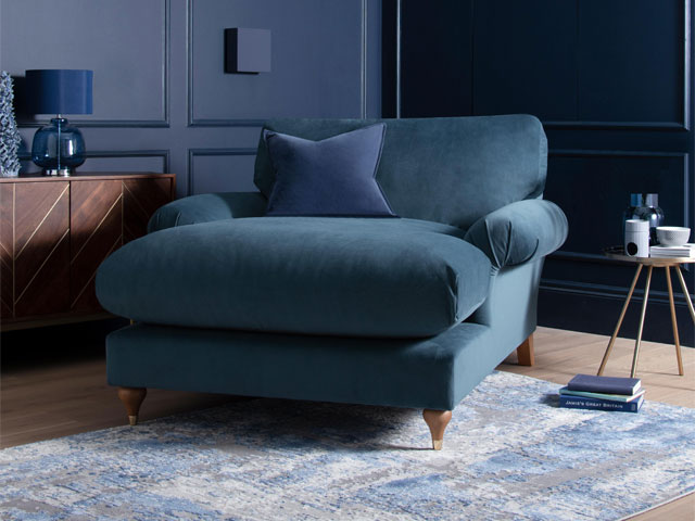
Blue hues
Opting for navy walls with an airforce blue sofa and paler blue rug offers a soothing scheme that’s great for a space where you want to relax. ‘Drench your room with airforce blue,’ says a Next Design Team spokesperson. ‘The modern tone is easy, and works really well with greys, neutrals or tonally with other blues.’ This means its easy to switch up your scheme if you tire of colour drenching. Love blue? Read how to decorate your home with blue.
Mabel Snuggle arm chair in Airforce Blue, from Next
Think pink
If you’re opting for a pink scheme, think in shades from burgundy to blush, but stay closer to one end of the spectrum than the other (ie. opt for predominantly lighter shades or darker shades, but don’t attempt a 50/50 mix of both). And lay off the accent colours, you want to stick to the same colour palette so think tonal shades rather than colour pops. Love pink? Check out these real homes that have embraced pink décor.
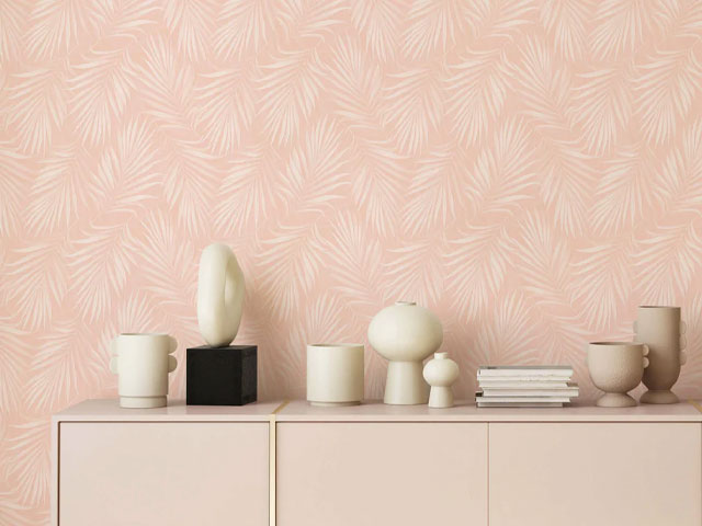
Areca Palm plant wallpaper from Bobbi Beck
Forest green
Dense and lush, deep greens are a great way to bring the outdoors in for the autumn-winter season. Patterned wallpaper is not excluded from the colour drenching interiors trend, but do try to keep things within the same colour palette. This print wallpaper works brilliantly when matched with a wall painted in the wallpaper’s predominant shade. Match the bed linen and cushions with lighter and darker shades of green for maximum effect.
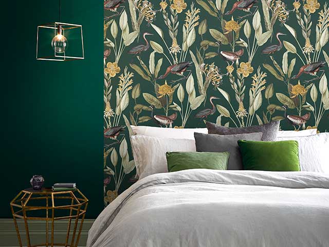
Glasshouse wallpaper from Graham & Brown
Rusts and reds
This scheme stretches colour drenching to its limits, running the full gamut of rich autumn-winter shades from a deep burgundy through to a rusty brown. Cushions in matching rusty shades are complemented by those in burnt orange and ruby red, with a rug featuring the same colour palette tying everything together.
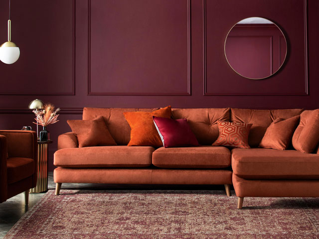
Parker button-back large corner chaise sofa in Plush Velvet Ginger, from Next