


Image Credit: Matthew Williamson
12 new pattern trends interior designers are loving
Pattern has an important role to play in the overall look and feel of our homes. Be it via soft furnishing, tiles, wallpaper or rugs, pattern not only adds visual interest to a room, it can be a great way to showcase personality and add some punch to a décor scheme.
“The way we dress our homes with pattern influences how we feel in the space,” explains Maria Benedita Veiga, architect and associate studio manager at Resi.
“We have seen an increased awareness from our clients on how playing with colours, motifs and textures can elevate the space and create a different atmosphere in each room.”
Despite the benefits of playing with pattern, it can also be pretty daunting, particularly if you tend to play it safe with your design choices. From knowing how to mix and match designs to keeping up with the current trends, pattern can be somewhat scary to those phobic of stepping out of their simplicity comfort zone.
“Mixing patterns might seem scary at first. But a little print-on-print action is exactly what your home needs to go from boring to boom,” explains interior designer Amanda Foster, from Foster Decor.
Turns out we’ve seen something of a switch up when it comes to pattern trends of late.
“The pattern game has been totally flipped on its head lately,” explains Amanda.
“We’re seeing a shift away from the super busy, in-your-face prints of the past and moving towards a more toned-down, artisanal vibe.”
Amanda says this calmer aesthetic has been influenced by a renewed focus on natural materials, handcrafted details, and simplifying our hectic lives in general.
But that certainly doesn’t mean bold designs are out.
From micro prints to modern regency, Amalficore to nostalgic chintz, here are the pattern trends interior designers have been adding into their schemes this year and how to successfully incorporate them into your own spaces.
Block printing
This year’s pattern trends have seen the return of simple repeat patterns that feel subtle but add interest to a room.
“One of my favourite pattern trends at the moment is block printing,” explains Amanda.
“These bold, graphic prints have a totally fresh feel, but the technique is actually ancient. Block printing originated in Asia and has been used for centuries to create fabrics with rich, complex patterns.”
Nowadays, Amanda says it’s showing up on everything from wallpaper to upholstery.
“The great thing about block prints is that they give you that coveted handmade look without being too fussy,” she continues.
“To really let these patterns shine, I recommend using them as an accent. A block-printed statement wall or set of pillows can completely transform a space!”
Micro patterns
On the opposite end of the spectrum, micro patterns are also having a big impact.
“Think petite florals, mini geometrics, and faint paisley prints,” advises Amanda.
“These tiny, intricate motifs have a delicate, almost vintage vibe that’s gorgeous.”
Don’t let their small scale fool you, though. Micro patterns pack a serious punch when used en masse.
“My tip? Go big by covering an entire room in micro print wallpaper or upholstering a piece of furniture in it. The overall effect is eclectic yet sophisticated,” Amanda adds.
Nostalgic patterns
This year, we are seeing a strong resurgence in patterns that nod to nostalgic aesthetics, such as chintz and vintage florals.
“People are seeking out patterns that evoke feelings of comfort and familiarity,” explains textile designer Clarissa Hulse.
In order to successfully incorporate nostalgic patterns into a space, Clarissa suggests using vintage floral or chintz wallpaper on a feature wall to create a charming focal point.
“Pair it with modern furniture to balance the look and avoid overwhelming the space,” she adds.
“Vintage-inspired accessories like framed botanical prints or antique vases can help tie the whole look together.”
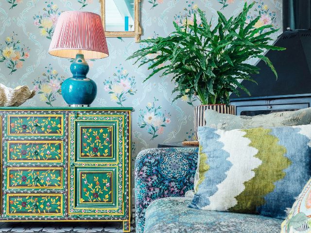
Maximalism
Maximalism is here to stay, with large-scale murals and bold, layered patterns in the spotlight – driven by the desire to express individuality and creativity.
“Nature-inspired prints continue to flourish, much to my joy, infusing our multi-tasking spaces with a much-needed calming atmosphere in today’s fast-paced world,” Clarissa explains.
But maximalism doesn’t have to mean cluttered chaos.
“Use a bold, large-scale mural as the focal point and layer in various patterns through cushions, rugs, and curtains in a mix of scales, which can help amplify the effect,” she says.
“Keeping a cohesive colour palette will ensure everything ties together.”
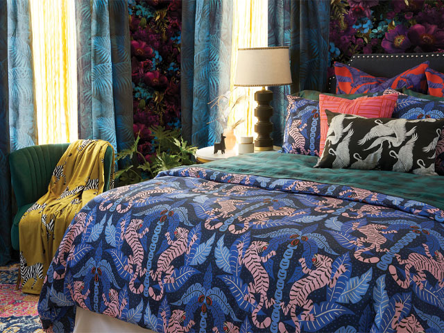
Bold botanicals
In a world that often feels fast paced and disconnected from nature, the bold botanical trend is a breath of fresh air, helping to transform our living spaces into soothing sanctuaries echoing the natural world.
“A cause close to my heart, botanical patterns help bring the outdoors in, through soft furnishings like bed linen or cushions that can be refreshed as the seasons change,” Clarissa explains.
“Compliment the look with natural materials such as wood or stone, and add greenery with potted plants to enhance the mood-boost factor.”
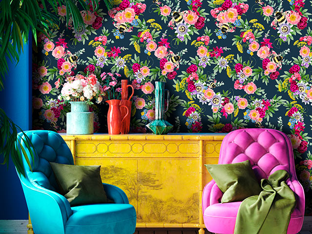
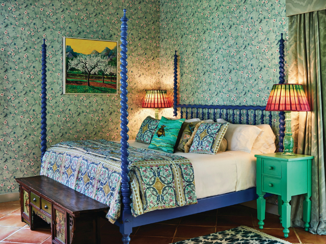
Pattern drenching
Scooch over colour drenching – pattern drenching is the new trend on the interior block for those looking for a bold way to enrich their spaces through pattern.
“Pattern drenching is a joyful way of elevating your interior and mixing prints that you’re drawn to,” explains interior designer Matthew Williamson.
If you’re looking to give pattern drenching a try, Matthew suggests having a clear palette in mind before you start.
“Try limiting your pattern drenched scheme to a few key prints, preferably with the same colour palette running through them or at least one colour that ties them together. For example, a floral pattern in a blue or green shade, whether blowsy and bold or delicate and ditsy, always brings an air of whimsy to the space,” he explains.
“To contrast this, I’d head towards something more graphic, such as a check or a stripe mixing blue, green and white, which invariably looks sharp. As in so many areas of design, things that come in threes always seem to work well, so I’d add in a third print, such as an animal spot or perhaps a classic ikat pattern in a complementing shade.”
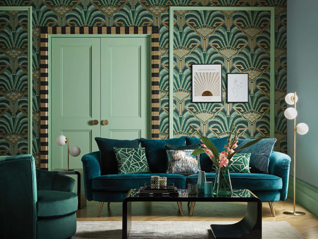
Modern Regency
Defined by opulence, gilded glamour and ornate detailing, regency patterns are having a moment, thanks largely to the success of hit period drama Bridgerton.
“Bridgerton and films shot in eras gone by are inspiring home owners to celebrate classic and regal patterns and introduce elegance to a space,” explains wallpaper designer and expert gilder, Daniel Bland, Bland Design.
“However, these historical artworks and patterns are given a modern twist. Patterns from the Regency period give a gentle acknowledgment to history but are now being given a bolder and more modern colour palette.
“The acanthus plant’s leaves have often featured on architectural and ornament decorations emanating from ancient Greece and Rome; it also inspired a William Morris print from the 1800s.”
For those considering using this beautiful pattern, Daniel suggests pairing it with a contemporary colour scheme such as gemstone pinks and royal blues.
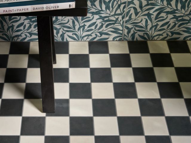
Checkerboard
It may have been around for centuries but the checkerboard pattern is having a major revival, offering a look that’s both retro and traditional.
“Checkerboard is in, and in a big way at the moment,” says Grazzie Wilson, head of creative at Ca’ Pietra.
“It’s a great way of adding interest, particularly in a bathroom.”
The contrasting print might seem a tad on the loud side but, when teamed with the right textiles, it almost becomes a neutral pattern, particularly if you choose the right colour palette.
“The overall look will be dependant more on the colours chosen than anything else, as it doesn’t have to be traditional white and black,” advises Grazzie.
“Instead, contrasting or similar shades can be used that can soften and warm the space.”
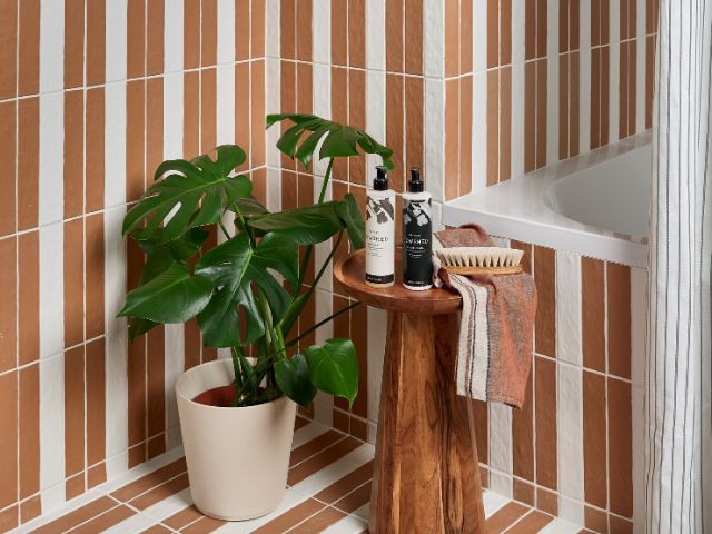
Stripes 2.0
Though stripes have always been a popular pattern choice, there are some creative ways to make the trend feel more 2024.
“You don’t have to stick to horizontal or vertical stripes only in the same room. Instead, think about combining the two, either by creating borders or even using horizontal on one wall and vertical on another,” advises Grazzie.
“The secret to making it work is to use shades of the same colour when used en masse and on vast expanses of wall.”
Western Gothic
First coined by Pinterest Predicts, the Western Gothic pattern trend blends vintage Americana with a dark and moody colour palette.
“We can attribute the rise in this pattern trend to the likes of Beyoncé and other Country music artists who have had a significant impact on the cowboycore style within the fashion and interior space,” explains Cassandra Leisz, creative director at Ruggable.
Amalficore
The Amalfi Coast has become one of the most trending locations to visit. Now, the Italian hotspot is beginning to influence interior patterns too.
“Expect to see an increase in citrus patterns, such as oranges and lemon prints joining the pattern trends of summer 2024,” explains Cassandra.

Clashing patterns
According to Melissa Denham, interior stylist at Hammonds Fitted Furniture, incorporating multiple patterns into one room can be tricky to pull off. But if you manage to hit the pattern-clash sweet spot, the results can be a unique space packed with interest.
Thankfully there are some ways to pull off a perfect pattern clash:
Consider the style that you want to achieve. Keep the two patterns within the same colour tones to help it all to feel coherent.
“If you go for two loud patterns, then try to keep one of them limited to a couple of cushions or a throw for a bed so that it doesn’t overwhelm the room,” Melissa advises.
Decide how many patterns to choose. You could take on the pattern-mixing look by just clashing your cushions and keeping the rest of the room simple and plain.
“When it’s on a small scale, almost any pattern will work together, be it stars, roses, tartans, zebra print – you name it. On a larger scale, you could also pair striped walls with big floral artworks or jazzy curtains,” Melissa advises.
Pick a dominant pattern. When using different patterns in the same room, Maria recommends choosing a dominant one and compliment it with more discreet motifs.
“Have fun adapting patterns to your own taste, creating the atmosphere that works best for you and speaks to you,” she says.
Choose your colours carefully. Melissa says it’s best to opt for colours that have the same hue and intensity, so that your space doesn’t look chaotic.
“If you are using a patterned wallpaper, pick out one of the colours for the rest of the walls. Otherwise, you could opt for different shades of the same colour (greens are thought to be calming and peaceful), or a theme, such as a soft pastels or autumnal reds,” she advises.
Place your patterns. Distributing your patterns evenly around your room will help create a balanced finish.
“Cushions, throws and lampshades can all be used to add pops of pattern, as well as rugs, which are an easy way to help to build the theme,” Melissa advises.
Keep the space clear. If you are going to go for mixed patterns in a room, then you need to keep the rest of the space in good order.
“Any clutter left lying around can ruin the aesthetic and just make it feel chaotic,” Melissa adds.