


How to use colour in without going OTT
Colour has the power to completely redefine any room in your home, transforming it from a purely practical space into a room that feels welcoming, personal and visually engaging.
And in your bathroom, it can turn a bland, functional zone into anything from a calming sanctuary to an energising retreat – it can also bring new life to your current fittings and accessories.
Introducing colour can come with its challenges.
For one, choosing too many colours in the same space can make it feel chaotic.
But if you play it too safe, you risk making the room looking bland and uninspiring.
The trick is finding a balance that brings personality without feeling overwhelming.
Thoughtful use of colour can create impact without dominating the room, and it doesn’t require committing to wall-to-wall brights or short-lived trends.
Here’s how to pick the right shades for your bathroom without going OTT.
Lead with one main colour
Choose one main shade and let it lead the scheme.
Think about the overall theme or feel that you want to convey and the colour that can help bring that to life.
Warm colours such as oranges and reds can feel uplifting and rich, but can dominate and overpower the room if used in large areas.
Natural shades (greens, taupes and earthy browns) will give a relaxing, nature-inspired feel.
But they can sometimes need a lift or contrasting accent colours to make them pop.
Once you’ve chosen your main colour theme, echo it subtly elsewhere in towels, accessories or cabinetry.
Interior designers use the colour wheel to find complementary colours to pair together.
Learning how to use this can be a really effective way to make your home cohesive.
Use colour where it has a purpose
Bathrooms have lots of hard surfaces, so colour can work best when it’s tied to a specific feature.
A coloured vanity unit, a painted ceiling or a feature wall allows colour to make a statement.
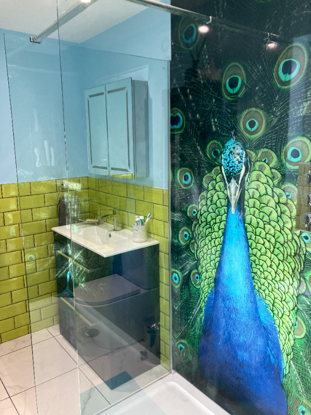
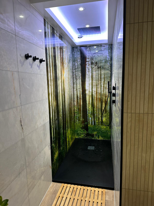
The shower area or above and behind a bath is an ideal place to introduce colour in a structured way as it is usually quite a large, flat space for colour or texture.
Showerscape’s shower panels featuring a photographic image or painterly artwork can be a great starting point in this respect – the colours in the image can anchor the feel of the room, and complementary colours can be selected to bring the whole room together, creating a unique design feature.

If tiling is more your thing, using an interesting colour, or textured and patterned surface within the enclosure helps define the space and creates a clear focal point.
Remember, it’s not necessary to tile the entire room floor to ceiling; using tiling in the wet areas and then a complementary bathroom paint colour for the walls makes it more varied and interesting.
Create cohesion with a feature wall
It can feel overwhelming to use a strong colour across several surfaces.
Instead, using large scale imagery, patterns or textures on a feature wall can provide a focus so that the rest of the room and accessories can be more simple and pared back.
A shower panel can fulfil this function.
It can introduce colour and pattern on one continuous surface, without breaking up the space with grout lines or multiple finishes.
If the panel colours reference the cabinetry, flooring or accessories elsewhere in the room, it can tie the shower area into the rest of the bathroom scheme.
Choose neutrals that will let colour pop
One of the easiest ways to avoid going OTT is to balance brighter pops of colour within an overall more neutral backdrop.
Warm whites, soft greys, stone tones and pale terrazzo all allow colour to stand out without overwhelming the room, whether this is on the floors, walls, or countertops.
Texture changes the way we see colour
Texture plays an important role in how colour is perceived, for instance, a soft matt finish will always feel more understated than high gloss, even in the same shade.
Textured finishes, fluted cabinetry or ribbed glass can add visual interest and warmth without relying on high-contrast colour combinations – ideal for bathrooms that need personality without visual noise.
Consider how light affects colour
Bathrooms often have less natural light than other rooms, which can dramatically change how colour looks.
Deep shades might feel cosy and luxurious in well-lit spaces but in darker rooms they can feel heavy.
Multi-point ceiling downlighting layered with ambient lighting around mirrors or fittings will also help colours appear softer and more flattering throughout the day.
If you do want to make a darker wall work well in a small space, however, teaming it with a Showerscape shower panel that has a ‘view’ will add depth and make a poky area feel bigger.
Let colour enhance mood, not dominate it
Bathrooms are spaces for routine, relaxation and quiet moments and colour should support that atmosphere rather than distract from it.
Soft greens and blues encourage feelings of calm; green represents peace and growth and is a welcoming pallet to use.
Warm neutrals feel grounded, while muted pinks or clays add warmth without overpowering.
Finally…
Using colour in your bathroom isn’t about being brave or bold, it’s about being intentional.
When colour is introduced thoughtfully, anchored to specific features and balanced with calm materials, it can elevate the space beautifully without ever feeling overdone.
We find Mylands (mylands.com) range of ‘dependable’ colours to be a gorgeous range of paint colours which would suit any room, from ‘butter yellow’ to ‘pale mint’ there really is something for everyone.
Andrea Clewett is co-founder of Showerscape, creating bespoke printed shower panels perfect for more than just home bathrooms – from swimming pools, camper van and narrowboat showers, to wetrooms, new-build extensions, listed properties, boutique hotels, holiday lets, cabins, and even hot tub surrounds.
READ MORE