


Everything you need to know about choosing artwork
We’ve teamed up with AttikoArt to create the ultimate guide on picking, displaying and styling artwork around your home
Melissa Tucker and Michelle Belak, founders of AttikoArt
Creating a collection of artwork for your home is a hugely personal journey, as it will change the personality of a room in an instant – but knowing how to go about it can be tricky.
To help you along your way, we’ve drafted in the superpower mother-daughter team behind AttikoArt; a beautiful original art brand (all pieces are designed in-house by the ladies) and a firm Good Homes favourite. In this exclusive guide, they’ll take you through everything you need to know, from how high to hang artwork and whether to match or clash to your existing decor, to choosing pairs of art and framing ideas.
Should artwork complement or contrast with my room schemes?
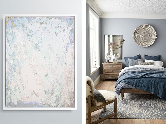
Blush Fizz canvas print, from £219, AttikoArt; bedroom from Pinterest
To match or to clash? It’s a good question and one we hear often. The answer? Both are beautiful – just different.
Matching colours is the most common choice because it’s nice and easy on the eye. It’s also the simplest one of the two to pull together… In theory! Working within a streamlined colour palette helps a room feel cohesive, however, matchy rooms can sometimes appear quite dull if not done properly. This is because the biggest mistake people make when matching tones is obsessing over finding the ‘exact shade’, whereas the key to nailing your monochromatic scheme is to use all the different shades and tints of your chosen colour. This is what will keep it stimulating.
Golden rule for matching artwork: look for colours in the same palette that don’t necessarily match exactly. Select a colour and then use its different shades and tones. If you find yourself wanting to introduce more colour as you go along, continue mixing light and dark tones to create a colour scheme which is subtle and very elegant.
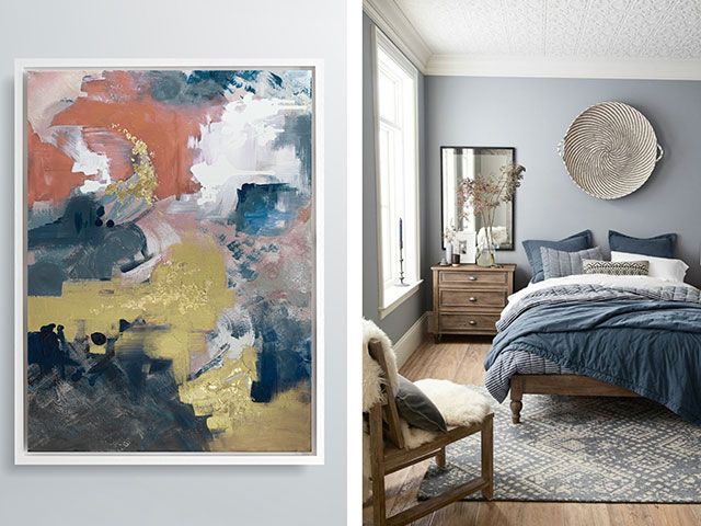
Indigo Polo canvas print, from £229, AttikoArt; bedroom from Pinterest
Clashing colours often scares people more because it can feel a little more out there or perhaps a bigger commitment! In actual fact, you needn’t be scared of them, because that wise old saying about how opposites attract couldn’t be more true of colour schemes. Whilst this approach may feel a little more daunting, a basic colour wheel will help you understand the optimal colour relationships, and how you can offset different colours and still achieve tonal harmony.
Golden rule for clashing artwork: Choose a piece of art that features a dominant colour that’s radically different from your decor. The really important thing to know here is that complementary colours (opposites on the colour wheel) create dynamic colour schemes.
What size piece should I go for?
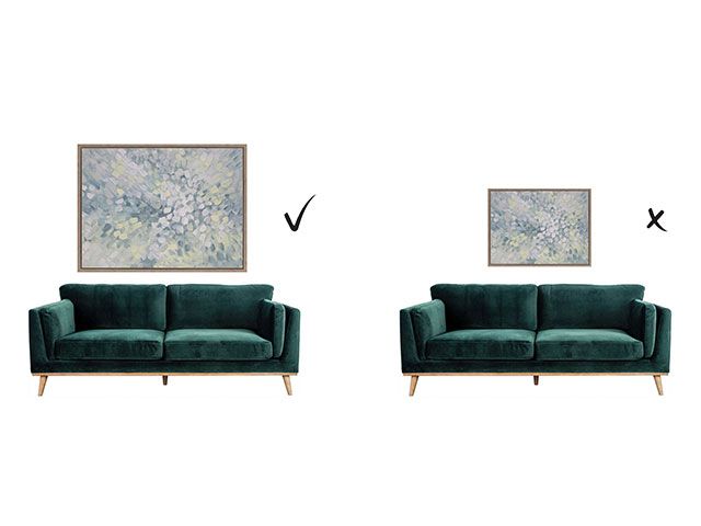
Emmy Burst canvas print, AttikoArt; Abode Panache three-seater sofa, from £1,005, Arighi Bianchi
Think about the scale of the wall and the furniture around it before you commit to a piece of art.
If you’re going to hang a painting above a large sideboard (or bed or sofa) don’t get The Fear and hang an apologetic little print that will be lost on the wall. Be bold and go BIG! It’s all about balancing out the proportions of the two together. Equally, you could choose to hang multiple pieces, which, as a group, also create the same large footprint.
Conversely, if you have a narrow, delicate side table remember that a huge piece of art above it will look top-heavy, so consider a smaller print for here instead. As a general rule, if use your piece of furniture as an indicator for the size of the artwork above it, you’ll achieve a much more successful composition.
Is there a tried-and-tested formula for hanging height?
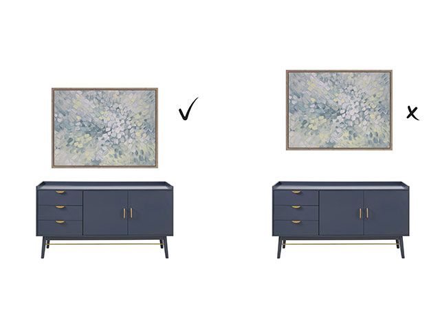
Emmy Burst canvas print, from £219, AttikoArt; Penelope dark blue sideboard, £324, Maisons Du Monde
We’re not big on hard and fast rules – sometimes breaking them is precisely what makes a space interesting. But we do believe there are two really useful pointers for hanging artwork successfully:
- Generally, lower is better. It’s amazing how many paintings are hung way too high. It’s probably the number one mistake that people make – and something that an experienced eye will pick up immediately because it just looks, well, off. If you’re not too sure about this, think of your furniture and art as one united block, not as two separate things. They have to ‘hang together’ spatially. And that won’t happen if the canvas is closer to the ceiling than it is to the furniture below it. See? Easy!
- Art needs space. Don’t feel you need to hang something on every wall. A bit of blank space can work wonders as a foil to your artwork, so maybe think of leaving one wall unadorned – this way your art can really shine.
How should I accessorise an art print?
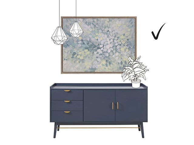
Emmy Burst canvas print, from £219, AttikoArt; Penelope dark blue sideboard, £324, Maisons Du Monde
Layering can be awesome. Much as we love a stunning piece of art to have centre stage, we do also really love a bit of layering. Don’t be afraid to have a ceiling pendant or floor lamp positioned in front of part of your art, or maybe a bit of lush foliage from a gorgeous pot plant creeping into centre stage. It can tie elements of your whole interior scheme together brilliantly, and the finished look is effortless and sophisticated all at the same time.
What things should I consider when choosing a set to appear next to each other?
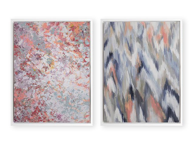
Pommy Bloom canvas print, from £219; Ziggy Brook, from £219, both AttikoArt
There are different ways to approach this, but if you want to combine a couple of pieces of art, we think it is important that they ‘belong together’ in some way. In order to achieve this we generally advise that they are:
- The same size
- Visually linked by colour
The above is an example of a set of two prints. As you can see, you can have two completely different designs but in coordinating colours, as we’re simply picking out the coral tones as the central link between the two.
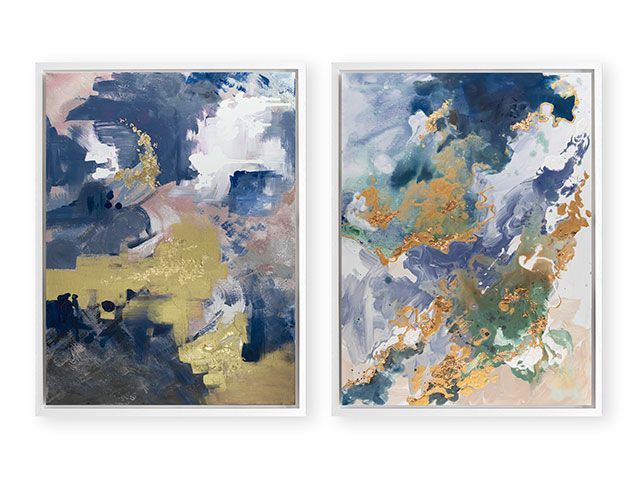
Indigo Polo canvas print, from £229; Marino Stone, from £219, both AttikoArt
Here’s another example: our Marino Stone canvas alongside our Indigo Polo. This beautiful pairing focuses on the complementary blue and metallic shades, and although the blues aren’t exactly the same, they’re still very much within one tonal family!
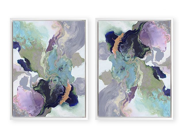
Ebony Swirl canvas print, from £229, AttikoArt
Or try this clever trick – simply buy matching prints and hang them different ways. What we love most about hanging our artwork side by side is that ‘two become one’ and the result is a really harmonious yet high impact.
How should I choose frames to finish off the pieces?
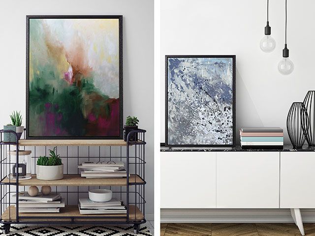
Sienna Mist canvas print, from £229; Airo Cool canvas print, from £219, both AttikoArt
We personally like to keep the artwork itself as the main focus and so recommend very simple, fine frames that finish it off but don’t compete for attention. We suggest neutral colours – black, white or natural wood – as these tones often tie in with some other decorative element in the room. If you think ‘organic materials’ and now take a quick scan around your room, you’ll be sure to find several! Perhaps you’ll choose to pick out your wooden flooring, or your black bi-fold doors maybe? Or how about a simple black pendant lighting cable, or even your granite worktops? Remember that this is the point where you are able to coordinate with the neutral tones of your room, so that you can let the accent colours in the artwork really sing!