


How to create a decorating colour scheme
Colour can be a challenging thing to add to your space – maybe there’s a colour that you’d love to include in your home, but aren’t sure how; or you’ve tried to recreate a scheme you loved, but it’s not quite worked out. It’s no wonder so many people choose to play it safe with a neutral home. However, once you get to know the basics of building a colour scheme, you can start to experiment and really commit to your own personal style. Here’s what you need to know to get started and pull together a cohesive palette…
Start with your space
When it comes to first choosing your colours, think about what you want to use the space for. Is it a relaxing space, or an energising one? Colours can have a strong effect on our mood, so have a read of our guide to colour psychology before you start.
Also consider which way your room faces. North-facing rooms get cold light, so work better with warmer hues to stop them feeling stark, while south-facing rooms get plenty of natural light, making them easier to work with a range of colours in.
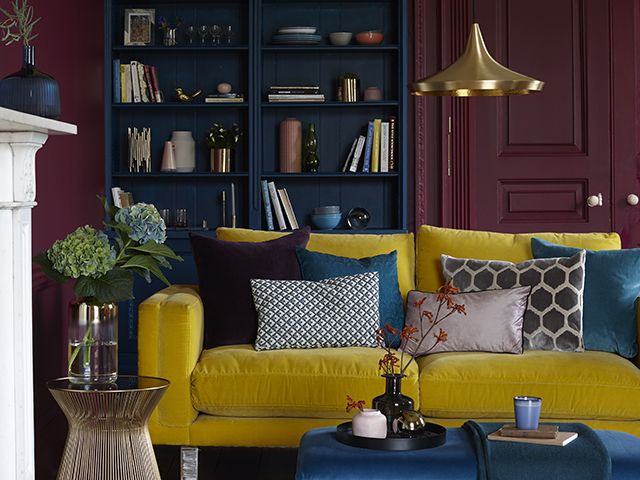
Photo: Good Homes
Pick a maximum of 3-5 colours
Sticking to one or two colours can sometimes cause your scheme to fall flat, so unless you’re a confident decorator, opting for at least three is a good idea. When you do eventually decide on your colour palette, the next task is to install it into your space in good proportions.
Decide which of your colours is going to be dominant, and which is going to be a slight accent. The magic ratio is 60:30:10 split across three colours, but if you’re using more, try to pair near colours to make up these percentages between them.
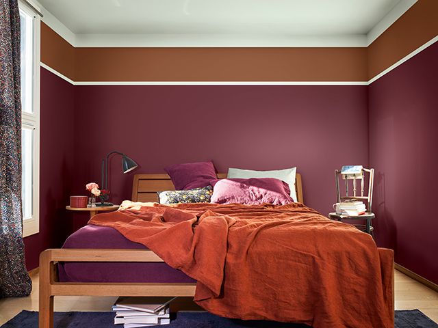
Photo: deVOL
Try a monochromatic colour scheme
Building a palette using one colour can be effective if using different shades. This scheme layers blues to create a striking look, but for a less intense hit of a single hue, you could always use a white base in a monochromatic room. A monochrome gallery wall can add a contemporary touch to a white wall, try these prints from Beach House Art.
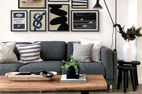
Photo: Beach House Art
Pair adjacent colours
Picking colours that sit next to each other on the colour wheel is another simple way to build a look. This scheme from Pooky marries blue, teal and emerald green for a sophisticated space that still has accent highlights, but that doesn’t rely on bold contrasts.
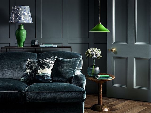
Photo: Pooky
Work a bold, complementary look
Complementary colours are picked from opposite sides of the colour wheel, meaning they’re the boldest contrast to each other – yet, they still work together in harmony. Orange is the opposite of blue in this instance, making for a strong accent, like this look from Furniture and Choice.
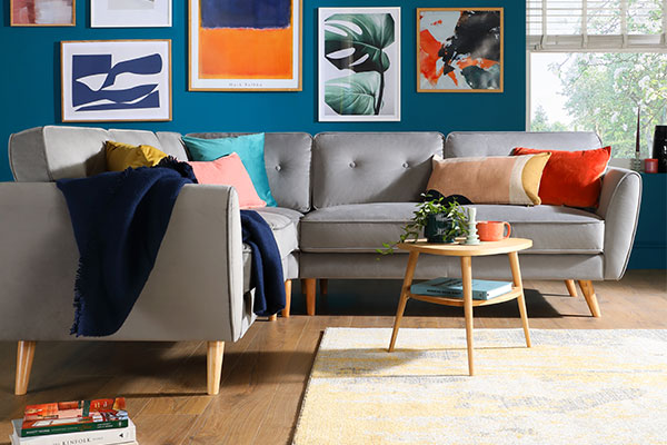
Photo: Furniture & Choice
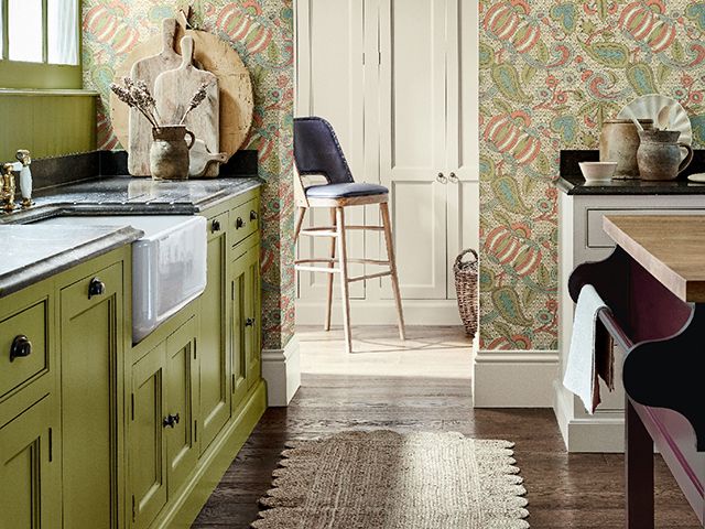
Add pattern
If you’re not confident in creating your own cohesive colour palette, why not start your scheme with a patterned wallpaper of fabric. That way, you can pull a palette from the design to tie in with the print. This idea from Little Greene, for example, pulls the olive green and red hue from the wallpaper for a scheme that feels really well put together.
Photo: Little Greene
MORE COLOUR IDEAS
- Colour of the Year 2023 – who called it best?
- How to decorate with colour
- The enduring appeal of teal