


Image Credit: Sofology
From matcha and strawberry to peaches and cream: Food-inspired colour pairings good enough to eat
When it comes to picking a colour palette for our homes, many of us will air on the side of caution, choosing to play it safe with demure decor and non-risky neutrals.
But recently we’ve been seeing a growing appetite for bolder, more joyful interiors. And colour inspiration is coming from some unexpected places, including our plates.
From the fresh green and pop-y pink pairing of matcha and strawberry, to the rich sophistication of espresso and hazelnut, food and drink has a knack for bringing together colours that you wouldn’t expect to work, but somehow look perfect side by side.
And thanks to them feeling familiar, taking cues from classic flavour pairings offers an easy entry point to those wanting to be a little braver with colour at home.
“I always say colour should be a feast for the senses,” explains Lulu Leonard-Biebuyck, lead colour consultant at Lick.
“Some of my favourite palettes are inspired by food because they instantly evoke a feeling, transporting you to a particular moment, memory or mood.”
Just like taste and scent, Lulu says colour has the power to spark an emotional response, whether that’s comfort, joy, nostalgia or a sense of calm.
“When I’m creating a scheme, I often think about how I want a space to feel first, and food is such a wonderful source of inspiration because it’s so closely connected to experience, atmosphere and emotion,” she continues.
“In fact, one of the words I use most when talking about colour is ‘yummy’ – because the best colour combinations have a richness, warmth and appeal that make you want to immerse yourself in them completely.”
So if choosing a palette feels a little overwhelming, take a look in your fridge, fruit bowl or local patisserie window, as the most delicious colour schemes might be staring right at you.
Here’s some expert-backed pairings that are good enough to eat and grace your walls.
Matcha and strawberry
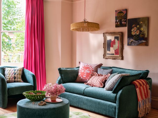
This summer, interiors are embracing nature’s sweetest contrasts with the vibrant pairing of strawberry pink and matcha green.
“Though positioned at opposite ends of the spectrum, the two shades feel perfectly balanced and instantly mood‑boosting,” explains Julia Bilotta, creative stylist at Sofology.
“Their popularity comes from the way they echo comforting, familiar flavours while still feeling fresh and modern.”
To bring the look home, Julia suggests starting with furniture such as a sofa.
“A softly curved design in a milky matcha tone creates a calm anchor, while strawberry pink walls or accessories add a playful pop,” she explains.
“Keep the palette cohesive by pairing brighter tones with gentler shades, and balance lively patterns with solid fabrics.
“Finish with relaxed styling, layered artwork, soft lighting and natural textures with scalloped details to add just the right touch of earthy and sweet.”
While this might feel like a relatively new pairing, Rachael, co-founder The Pickleson Paint Co, says it captures exactly the kind of balance we’re seeing people gravitating towards; earthy, calming greens softened by warmer, fruitier tones.
“Pickelson’s Aegean Sage and Filthy Terracotta recreate that same contrast beautifully,” she explains.
“The muted sage brings a grounded, restorative feel, whilst the red-toned terracotta adds warmth and a sun-baked richness that stops the palette from feeling too cool or clinical.”
Together, Rachael says this colour pairing feels relaxed, contemporary and deliciously Mediterranean.
“In our master bedroom, we’ve colour drenched with Aegean Sage and brought the richer, fruitier tones through on the shutters, pottery, picture frames and textiles.”
Dairine Nethercott, head of design, MOON says vibrant sorbet and berry pinks are perfect for injecting a high-spirited energy into a room.
“To keep the scheme grounded, introduce these pinks through secondary tailored checks or stripes on furnishing fabrics which will create a sense of balance,” she advises.
“For a quieter statement, a simple textured throw adds that playful, edible pop of colour with zero risk.”
Peaches and cream
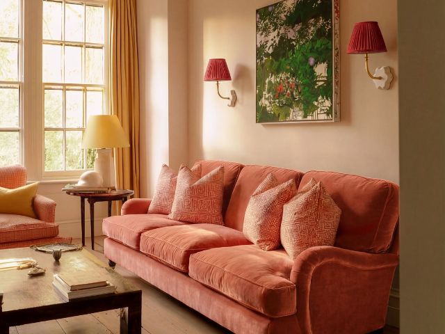
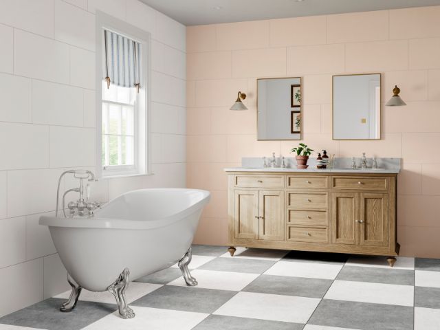
Sweet without being too sugary, peaches and cream combines mellow orangey tones with creamy whites to create a colour palette that’s as comforting as the classic summer dessert itself.
“Orange 03 and White 03 capture that instantly recognisable warmth – the soft, sun-ripened sweetness of the fruit against velvety cream,” explains Lulu.
“Both shades feel comforting and uplifting, wrapping a room in warmth without overwhelming it.”
In order to utilise the pairing in your own décor, Lulu says she’d colour drench a space in the peach and introduce the cream through smaller details such as a bedside table, picture frames or a painted door for balance.
“For those who want to add a little more warmth, Pink 02 works beautifully as an accent, echoing the blushed tones you find in the ripest peaches.
“I particularly love these shades alongside brass hardware, which beautifully complements their warm undertones.”
Olive and cheese (and a hint of red)
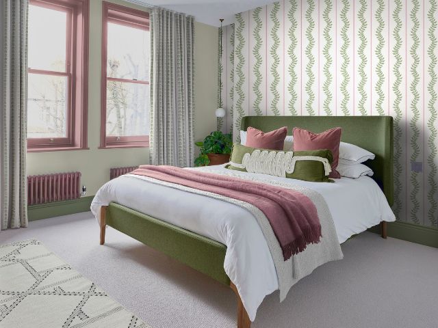
A classic olive and cheese combination proves that muted colours can still make a statement, blending salty sage greens with creamy, cheese-inspired shades for a timeless look that’s both grounding and inviting.
“This palette is inspired by olives, cheese and a perfectly chilled martini,” explains Lulu.
“Green, yellow and red might sound unexpected, but together they’re joyful, characterful and wonderfully balanced.
“Imagine a conservatory drenched in green, with a pop of red coming through in a painted dining table and garden doors highlighted in yellow?
“The combination feels playful yet earthy, creating a space that is both energising and comforting.”
If you’re looking for a gentle way to introduce this collection of hues Lulu suggests picking out a tablecloth that incorporates all three colours.
“Textiles are one of the easiest ways to make a room feel cosy, personal and inviting, and a thoughtfully chosen tablecloth can become a focal point that brings colour, character and personality into the space,” she adds.
Lemon and elderflower
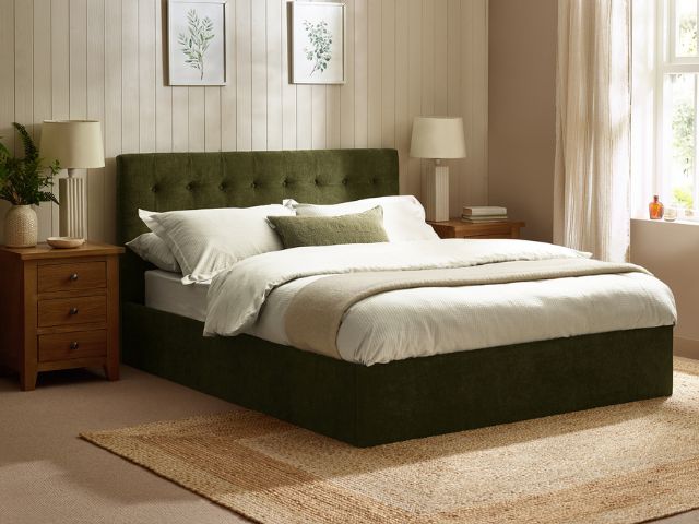
What could be more refreshing than a lemon and elderflower lemonade on a hot summer’s day? But the combination transfers well to decor too.
“Together this combination feels fresh, uplifting and full of optimism,” explains Lulu.
“I’d recommend using the lemon, something like Yellow 05, across the walls and ceiling of a hallway, with the creamier hues of elderflower, on the panelling to add depth and contrast.
“One of my favourite panelling tricks is to carry the colour all the way down the skirting boards and continue it across the door frames and doors,” Lulu continues.
“This creates a seamless effect that elongates the walls and makes the space feel taller and more expansive.”
Espresso and hazelnut
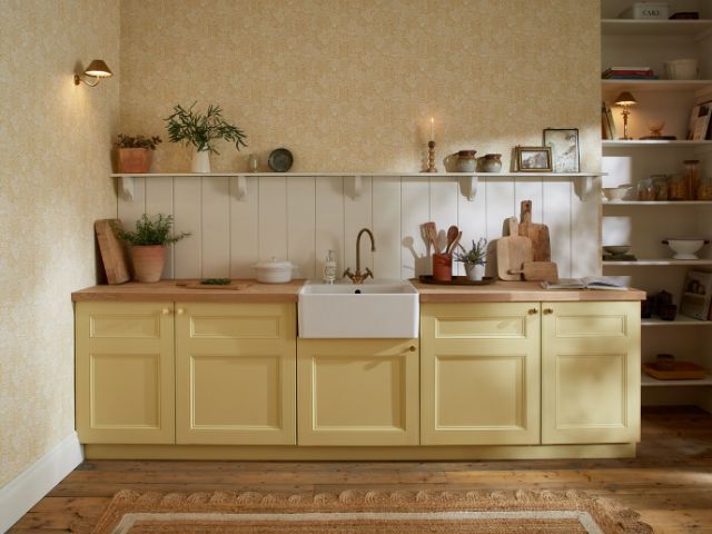
Inspired by a perfectly poured Greek Iced Espresso AKA a Freddo Espresso, this palette blends rich coffee browns with creamy caramel tones and frothy off-whites for a look that’s warm, sophisticated and full of depth.
“The Greek Iced Espresso has become incredibly popular recently and really is a thing of beauty,” explains Rachael.
“It’s strong, yet so simple, which is a great ethos to apply to interiors.”
Rachael says this combination creates layered depth whilst not overpowering a space.
“With this palette, going for a deep chocolatey brown on the walls, for example Pickleson’s Sunday Brown, gives you an enveloping, rounded feeling while the lighter neutral ceiling, such as Drunk Tahini, offers height, making the space feel more balanced and expansive,” she continues.
Ruth Mottershead, creative director at Little Greene agrees this particular colour pairing is a winning combination for interiors right now.
“The trend for rich, cocooning living spaces that bring a sense of comfort continues with a move toward the soothing power of darker and mid-tone caramels,” she explains.
“A rich and indulgent mid brown, such as Affogato, perfectly combines the warmth of coffee with the gentle sweetness of vanilla hues to create a cocooning and comforting colour,” Ruth continues.
“Pair with smart, dark brown, something like Chocolate Colour, or soft, off-black Lamp Black to create a captivating, sophisticated scheme.”
Pistachio and chocolate
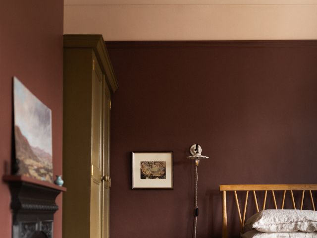
Balancing cocooning chocolate tones with soft pistachio green, this colour pairing brings together warmth and freshness in equal measure.
“This is a rather indulgent pairing, with the freshness of a chartreuse green grounded by the warmth of an earthy brown,” explains Rachael.
“It’s a combination that feels both nostalgic and quietly luxurious, which is why it works so beautifully in the home.”
Rachael suggests introducing, an earthy brown, like Hot Chocolate, through painted furniture or woodwork to add depth, then layering in the pistachio, something like Larder Green, through cushions, ceramics or cabinetry for a softer contrast.
“Together, they create spaces that feel welcoming, cocooning and full of character,” she adds.
Rhubarb and custard
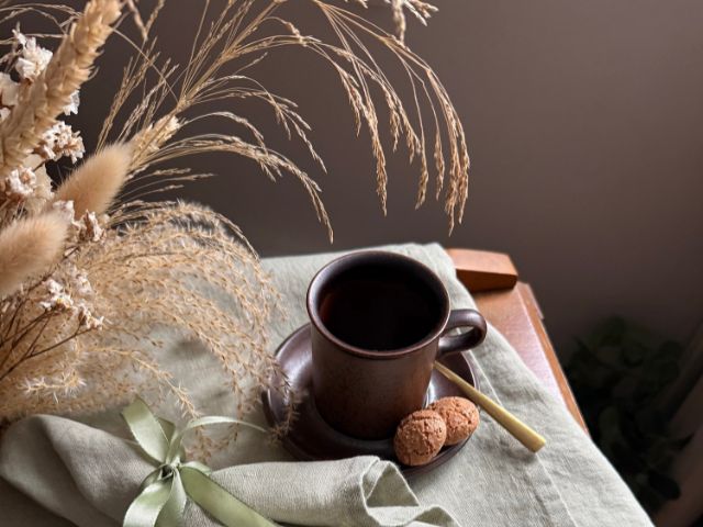
Rhubarb and Custard has always been a wonderfully kitsch pairing, but lately it’s taken on a more refined feel.
“Chef Ben Lippett offered his own take on the delicious dessert recently, which proves this combination is firmly back on the radar,” explains Rachael.
“Following suit in the more refined department, Pickelson’s Lido Pink captures that same mood perfectly,” she continues.
“It’s a softer, more pared-back interpretation of the vivid candy pink we often associate with rhubarb, giving the pairing a more grown-up and liveable feel.”
Rachael suggests drenching a room in the pinky hue and splashing in the custard through painted furniture, lampshades or a sofa for a subtle nod to the trend.
Ganache and liquorice
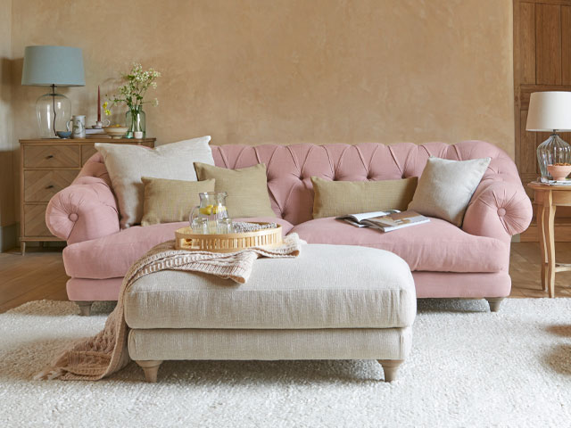
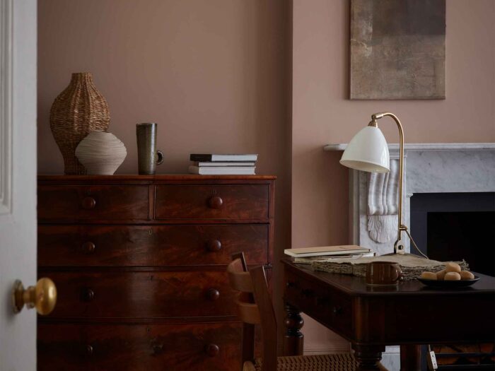
According to Ruth chocolate brown shades are perfect for creating smart spaces that bring indulgence, comfort and warmth to the home.
“When used across all elements, they can really envelop a space, adding impact and drama, as well as partnering beautifully with neutral hues and natural finishes for a tonal contrast.”
She suggests using deep chocolate tones in a colour drenching scheme across walls, woodwork and the ceiling for a truly impactful, cosy finish.
“With their earthy tones, rich, chocolate browns are a subtle nod to nature and work wonderfully with natural materials such as stone, wood, wicker and rattan finishes,” she continues.
But if you’re feeling really bold, Ruth says you could also pair deep chocolate with an even darker hue.
“With its enviable profundity, new rich brown Ganache is likely to be the darkest shade in your scheme, but consider pairing it with the even darker, Chocolate Colour, or true black, Jack Black, for a deeply committed and effortlessly elegant interior design statement,” she adds.
Milk and honey
Inspired by one of nature’s sweetest combinations, honey and milk layers rich golden tones with velvety creams to create an interior that’s both comforting and sophisticated.
Little Greene’s muted gold Madeleine is a sophisticated honey tone that delivers tranquillity and warmth.
“A contemporary alternative to more traditional cream tones, Madeleine is gentle, yet deliciously sweet,” explains Ruth.
”Its yellow base, grounded by a hint of brown, creates a welcoming and comforting hue that is perfect for hallways, living spaces or kitchens.”
Ruth suggests pairing Madeleine with milky neutral tones, such as Portland Stone and calming off white Linen Wash for an elegant and classic option for your interiors.
Biscuit and caramel
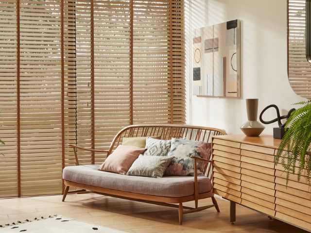
As every confectioner knows, the combination of biscuit and caramel is irresistible, but as well as being a delicious flavour combination these two colours combine, magically, to cosy-up a room and lend the space a feeling of calmness and sophistication.
“Grounding earth tones are having a moment so choosing these shades through paint, furnishing fabrics or accessories will create a contemporary look and feel that not so much shouts, but whispers, understated elegance,” explains Rohan Blacker, founder of Schplendid.
Summer fruits and blue macarons
Another of Lulu’s favourite pairings is inspired by summer fruits and blue macarons eaten at a picnic on a hot day.
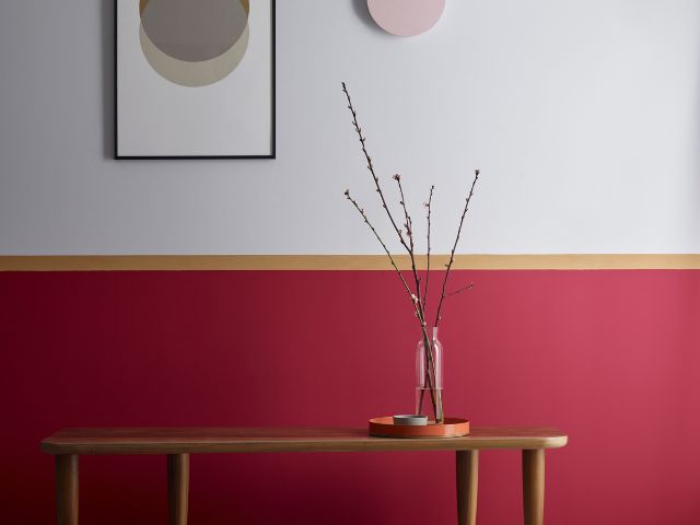
“Picture biting into a juicy cherry or a chalky blue macaron while looking up at a vivid summer sky,” she explains. “Red 06 and Blue 15 recreate that irresistible combination.
“I’d use the blue on the ceiling to evoke the feeling of endless summer skies while keeping the room feeling open and airy,” she continues.
“A neutral white on the walls creates a fresh backdrop, while atmospheric red on the woodwork adds depth and grounding.”
For an extra layer of richness, she suggests introducing accents of purple, through artwork or accessories to echo the deeper tones found in ripe cherries.
Want more inspiration? Read: Devil Wears Prada interiors: 12 ways to channel Miranda Priestly at home or Why Rivals interiors are the nostalgic decor trend we didn’t see coming. And check out All set for a Kennedy summer? 12 ways to get the Love Story look in your interiors
READ MORE: