


Image credit: Crown
Paint colours – on trend shades for autumn
Choosing the perfect paint colour for a bedroom, living room or kitchen is a tricky business. Not only do you have to select from myriad shades on the colour spectrum and match any existing furniture, but how do you know the colour you pick won’t quickly become outdated?
Anne Haimes, Design Director and Founder of Anne Haimes Interiors, shares her expert opinion on the paint colours that are no longer in style this autumn, and what shades to replace them with.
Homeowners looking to spruce up a room with a fresh coat of paint can rest assured any of the below choices will stand the test of time.
Come on Barbie
Barbie pink was the hottest shade for the summer, thanks to the launch of the much-trailed movie and its huge box office success. The trend was ideal for adding a feminine punch into interiors and even inspired a global shortage of pink paint.
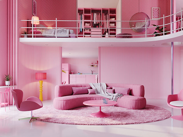
But while the film is still filling seats in cinemas, the heat for pink paint colours has died down.
“Bright pink interiors certainly aren’t for everyone and aren’t always easy to live amongst,” notes Haimes.
“If you’re coming down from the Barbiecore hype but want to maintain the same electrifying tones, try electric coral instead. The colour is perfect for eclectic tastes, tying into this year’s red trend while still injecting the same boldness of Barbiecore.”
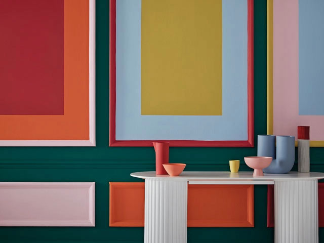
Seeing red
Red may be dominating the catwalk this autumn, but that doesn’t necessarily mean the boldest shade translates straight across to interior design.
Primary red can be too harsh for interiors, but opting for a paler, softer variation will give you a modern look.
“Lean into earthier, brown-toned reds such as rust. Be sure to dull red’s boldness with muted clay undertones for a modern look,” Haimes advises.
“Alternatively, go for darker shades with hints of purple such as eggplant or plum to make a room feel enclosed and cosy.”
Feeling blue
Navy walls reached their height of popularity in 2020 with the rise of homeworking and home offices. Indeed, Classic Blue was chosen as Pantone’s colour of the year in 2020. However, the rush to paint everything navy interiors has since waned. Instead, consider a certain shade of green.
“While dark blue exudes sophistication, it lacks warmth and homeliness. For a happy medium, try a dark olive green instead,” Haimes advises.
“Pick an olive green with a grey-toned base to help balance the warm and cool tones while maintaining that same sense of sophistication that navy blue brings to interiors.”
Typical teal
Teal, which combines blue and green hues, has suffered from its popularity and been slightly overused. Earthy tones like terracotta and olive green are now taking its place, infusing warmth and a connection to nature.
“If you want to replicate teal’s serene, cool atmosphere without such a bold punch, try instead soothing colours such as pale sage or muted lavender,” says Haimes.
Grey day
In the past, grey was hailed for its timeless and versatile appeal. While grey paint colours will never fully go out of style as a staple shade for interior design, trends have evolved to more complex and intriguing colours. Think warmer tones and more natural variations, preferable to cold, clinical grey.
“For a more modern neutral, look instead to beiges. Alternatively, pick a grey with a warmer base such as green, pink or brown-toned slate colours,” says Haimes.
“Lovers of dark charcoal greys can still make the colour look bang on trend with the right styling. Take inspiration from the Japandi trend to expertly balance grey rooms with plenty of natural materials and warm furnishings.”